About Bunken Tech Sans SC Wide Font
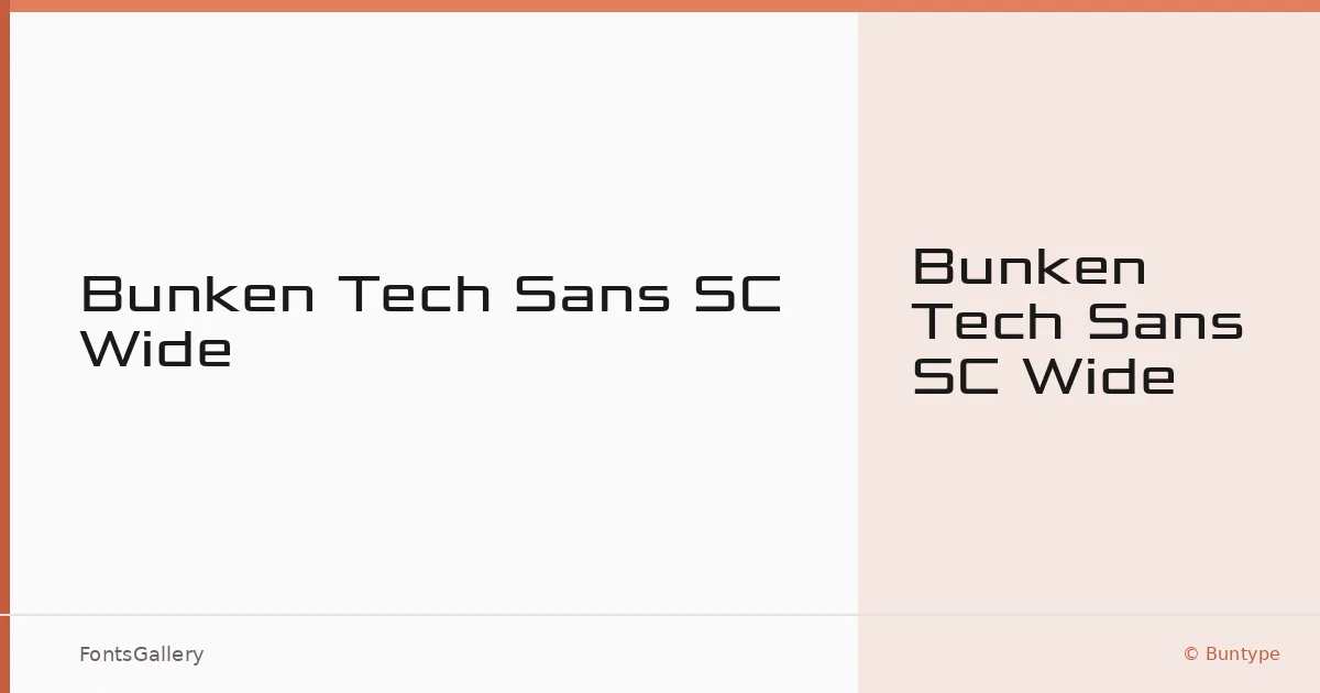
There is something deliberate in the way these letterforms hold their ground — wide, even, and unhurried. Designed by Ralf Sander and Petra Niedernolte and published by Buntype, this small-caps wide sans was built with technical clarity in mind. The extended proportions give each glyph room to breathe, lending the overall texture a measured, architectural quality that reads as confident rather than aggressive.
Design Aesthetics & Character Characteristics
The family is available in a single cut — Medium — delivered as an OTF file. That restraint is telling: this is a face that commits to one register and owns it. The wide stance, geometric structure, and modern finish sit naturally in futuristic and professional contexts, carrying a boldness that comes from proportion rather than weight. In Latin-script settings, the spacing feels engineered, which suits headline and display work far more than running text.
Recommended Usage & Font Pairing
It earns its keep in branding, logo lockups, presentation decks, and large-format signage, anywhere the type needs to project presence at a glance. For pairing, the structural rigidity contrasts well against the editorial softness of Canela or ABC Arizona, and it can hold its own alongside the calligraphic warmth of Angeletta or Armelie. Those needing something more playful in the secondary role might reach for Minecraft.
License & Usage Terms
This family is distributed under a Personal Use license — commercial use is not permitted, so confirm your terms with Buntype before placing it in any client or revenue-generating work. Embedding is restricted to preview and print only; full details are available at http://www.buntype.com/service/license.html.