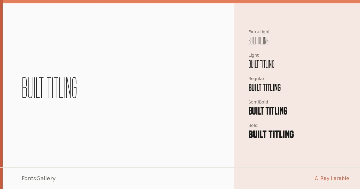
About Built Titling Font
There is a clean, taut economy to these letterforms — geometric without being cold, stripped back without losing presence. Ray Larabie of Typodermic Fonts designed this sans serif titling family to hold its ground at display sizes, where its precise proportions and minimal detailing read with real authority.
Design Aesthetics & Character Characteristics
The family spans ExtraLight through Bold, each weight available in both upright and italic, giving you ten cuts delivered as OTF files. The mood runs from quietly minimal in the lighter grades to confidently bold at the heavier end — modern and professional throughout, but never cold or mechanical. Italics carry a subtle energy that keeps the lighter weights from feeling insubstantial at large scales.
Recommended Usage & Font Pairing
This is a family built for headlines, posters, magazine folios, and brand lockups where Latin-script clarity is the priority — the kind of typesetting where a face either earns its place or gets cut. It pairs well with Canela, Rasley Heights, and Times New Roman when you want a contrasting serif companion, and sits naturally alongside Angeletta or Dharma Gothic E when a more contemporary combination suits the brief.
License & Usage Terms
Built Titling is distributed under a Personal Use license — commercial use is not permitted under these terms, so confirm your usage against the current Typodermic Fonts license agreement at typodermicfonts.com/license before committing it to a paid job. Embedding is limited to preview and print only.