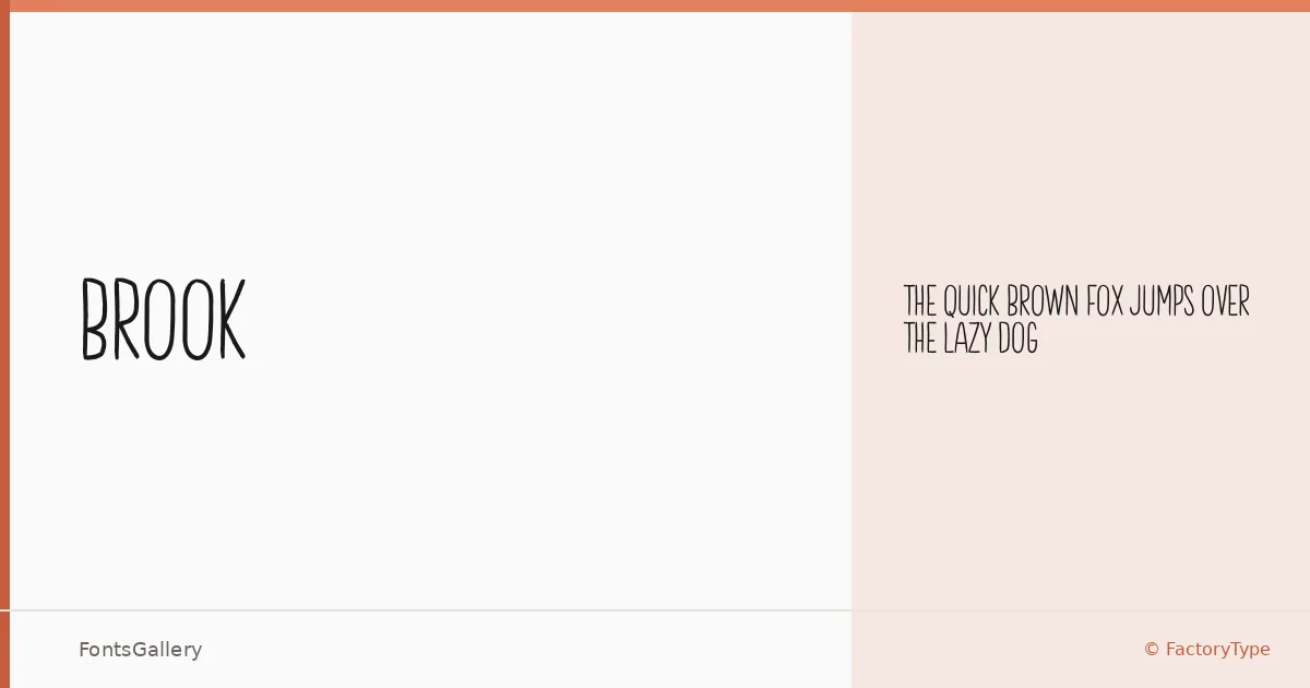
About Brook Font
There is a deliberate quietness to this sans — clean terminals, restrained spacing, and a geometry that never tips into coldness. Wahyu Rahmawan of FactoryType drew it with a minimal hand, letting each letterform carry weight through proportion rather than decoration. The single Regular cut is offered as part of FactoryType's freebies collection.
Design Aesthetics & Character Characteristics
It sits squarely in the modern sans serif category, with an elegant, minimal character that reads as confident without being loud. That restraint makes the Regular feel larger than a single-weight family often does — the forms have enough personality to anchor a headline or logotype without demanding optical correction. Coverage extends across Latin (partial), which covers the core Latin alphabet for most Western-language work. The file ships in OTF format.
Recommended Usage & Font Pairing
Brook earns its keep in branding systems, poster headlines, magazine folios, and logo lockups where a clean modern line is the brief. The partial Latin coverage is worth checking against any specific character requirements before committing to a multilingual project. For pairings, it has been recommended alongside Canela, Armelie, 321 Impact, ABC Arizona, and Kactigona — a range that spans editorial serifs and display faces, giving you room to build contrast-rich hierarchies.
License & Usage Terms
The family is available for commercial use under FactoryType's Freebies license, with installable embedding permissions included.