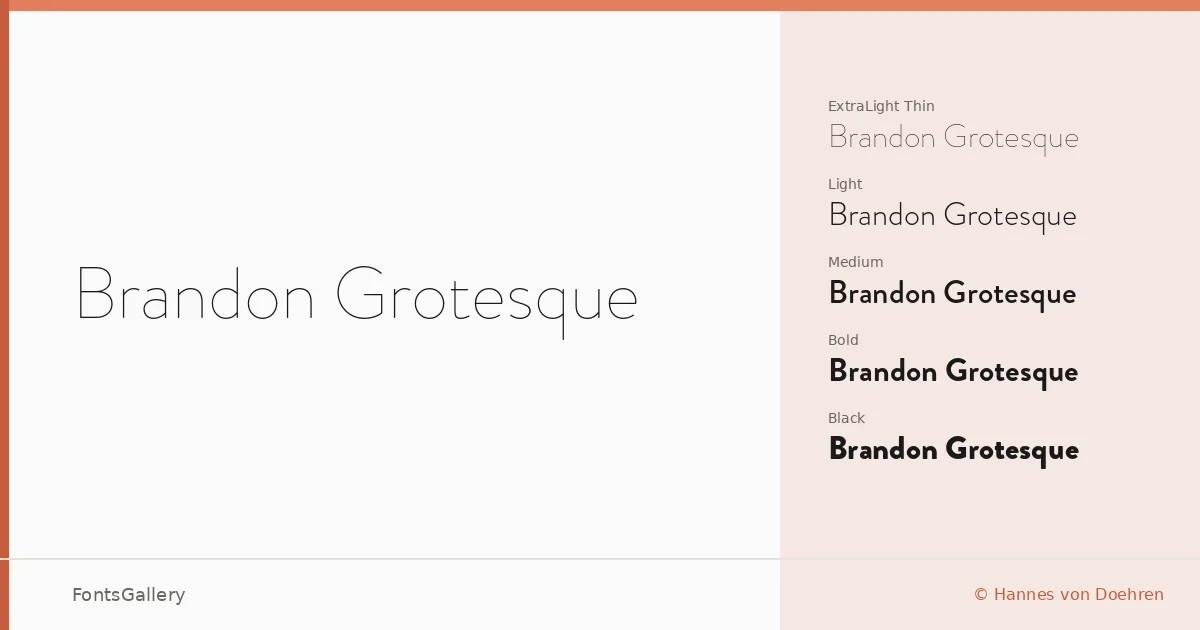
About Brandon Grotesque Font
There is a particular kind of geometric sans that sits cleanly without feeling cold, and Hannes von Doehren's Brandon Grotesque lands precisely in that register. Drawing on the rational geometry of early twentieth-century grotesques while softening their edges just enough, it achieves a warmth that most strict geometric cuts sacrifice. The result is a family that reads as disciplined without feeling remote.
Design Aesthetics & Character Characteristics
The family spans twelve styles — Thin through Black, each with a companion italic — giving you a wide tonal range within a single coherent system, all available as OTF files. The minimal stroke contrast and clean terminals make it feel at home in professional, modern contexts, while the elegant proportions keep it from tipping into the purely functional. Even the thinnest cuts hold their structure, and the Black italic carries a confidence that holds up at display sizes without shouting.
Recommended Usage & Font Pairing
Its combination of elegance and restraint makes it a natural fit for branding work, logo design, business cards, and magazine layouts where the typography needs to carry authority without dominating the visual content — website headers in particular benefit from the weight range available across the family. It pairs well with serif companions like Canela for editorial contrast, and the script Armelie adds personality where the grotesque supplies structure; 321 Impact, AQUA, and Kactigona offer bolder or more expressive alternatives when a layout calls for deliberate tension between faces.
License & Usage Terms
This family is available under a Demo license — personal-use trial terms only, with no commercial use permitted, so confirm licensing directly with Hannes von Doehren before taking it into a client job. The font is marked as installable for embedding purposes.