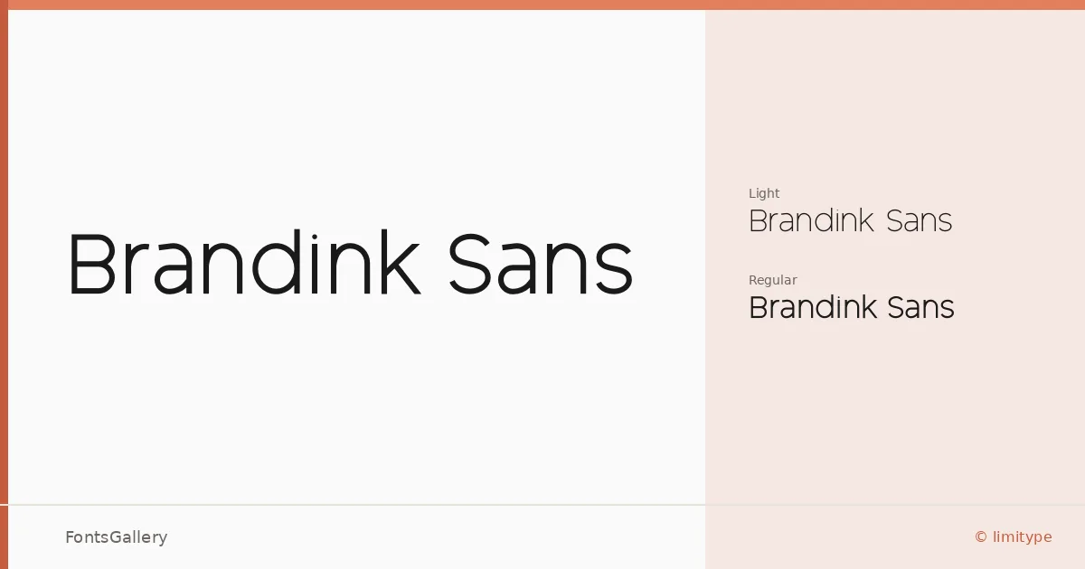
About Brandink Sans Font
There is a particular kind of quietness to this sans-serif — the kind that holds its ground in a logo without competing with the content around it. Brandink Sans, designed by Muh Muammar of limitype, arrives in two cuts: a Light and a Regular, both in OTF format. The letterforms sit in that clean, open territory where geometry meets restraint, keeping stroke contrast low and spacing considered.
Design Aesthetics & Character Characteristics
The family reads as minimal and modern without feeling cold. Light carries an airiness that suits refined, editorial moments, while Regular steps in with enough presence for headlines and identity marks that need to land with authority. Neither weight overreaches — the two work as a natural pair rather than dramatic contrasts. Latin character coverage keeps the focus tight and well-resolved.
Recommended Usage & Font Pairing
The design logic points clearly toward branding work: logo lockups, business cards, presentation decks, and website headers where a clean, professional voice matters. It pairs well with the contrast of a bracketed serif like Canela or Times New Roman, and holds its own alongside display faces such as Angeletta, Dharma Gothic E, or Rasley Heights — each pairing trading on the tension between Brandink Sans's restraint and the character of its companion.
License & Usage Terms
This family is available for commercial use, and the embedding permission is installable, making it suitable for document workflows as well as screen and print production. Confirm current terms at the foundry's Behance page before deployment.