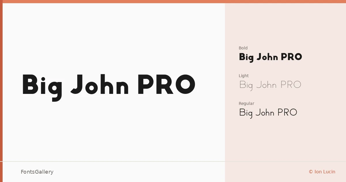
About Big John PRO Font
There is something immediately commanding about these letterforms — wide-set capitals, clean geometry, and a confidence that reads from a distance without shouting. Designed by Ion Lucin and Carlos de Toro, the family is built around a bold, minimal structure that keeps every curve and terminal deliberate. The OTF files cover Latin script with the kind of consistency you want when spacing is critical.
Design Aesthetics & Character Characteristics
This is a modern sans serif that leans into restraint rather than decoration — the kind of face that holds authority through proportion alone. The family ships in three cuts: Light, Regular, and Bold, spanning from understated to assertive without ever losing that clean, professional core. Even at the lightest weight, the letterforms carry enough presence to anchor a layout; at Bold, they own the page. The OTF format keeps rendering sharp whether you are setting a headline large or locking up a wordmark small.
Recommended Usage & Font Pairing
These weights were built for high-visibility work — poster headlines, branding systems, logo lockups, and website headers where the type needs to establish hierarchy in a single glance. The minimal construction makes it particularly strong alongside faces with more texture or contrast: Canela and Rasley Heights both bring a softness that balances the geometry well, while Dharma Gothic E adds another layer of structural weight if you are stacking display type. For something more editorial, Times New Roman or Angeletta provide a useful tension against the hard-edged sans.
License & Usage Terms
Big John PRO is available for commercial use, and the files include editable embedding permissions, making them suitable for documents and interactive work. Note that Slim Joe is a registered trademark of Ion Lucin.