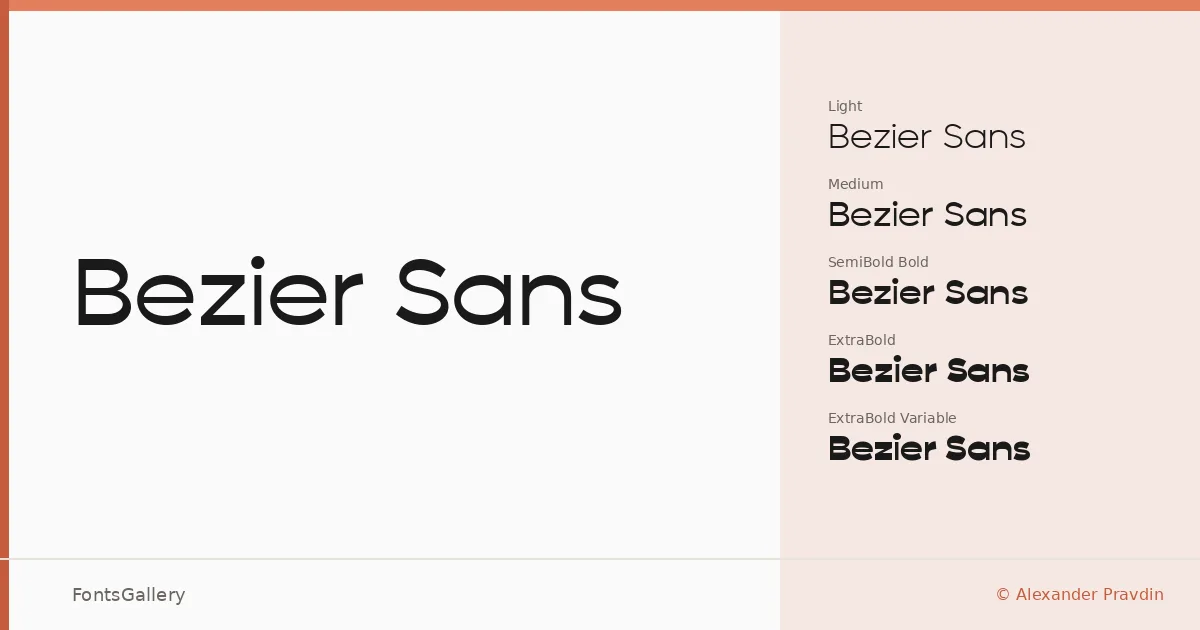
About Bezier Sans Font
There is a precision to these letterforms that earns the name — clean terminals, controlled curves, and a geometry that never tips into coldness. Alexander Pravdin built this family across four static cuts — Light, Regular, Bold, and ExtraBold — plus a Variable file, giving you a single TTF that moves fluidly through the whole weight range. The result is a sans serif that sits confidently between the minimal and the assertive.
Design Aesthetics & Character Characteristics
The overall mood is modern and professional, with enough weight contrast between the Light and ExtraBold to carry both text-level restraint and headline punch. The strokes are precise without feeling mechanical, and the proportions hold up equally well in tight logo lockups and open magazine spreads. Beyond Latin and Cyrillic, the family extends to Vietnamese, Greek, and Georgian — a breadth that reflects careful attention to scripts with genuinely different structural demands.
Recommended Usage & Font Pairing
This family earns its place in branding systems, website headers, and editorial titles where a clean, bold presence matters. The variable file makes it especially useful in responsive web contexts where a single font resource can do the heavy lifting across breakpoints. For contrast in layout, the listed pairings worth considering are Canela, Angeletta, Rasley Heights, Dharma Gothic E, and Times New Roman — each brings a different texture against the geometric neutrality here.
License & Usage Terms
Bezier Sans is available under Personal Use terms, described as free to try, with embedding limited to preview and print only — confirm a commercial license with Alexander Pravdin before deploying this family in any paid or client-facing work.