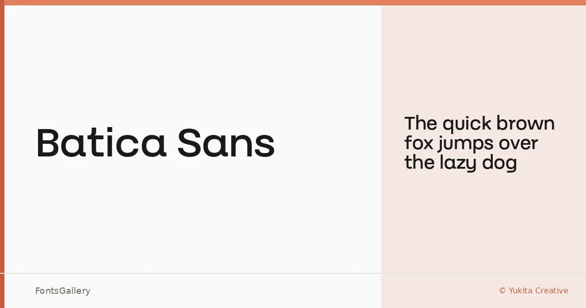
About Batica Sans Font
There is a clean restraint to this sans-serif that announces itself immediately in the spacing and stroke weight — nothing superfluous, nothing apologetic. It comes from Yukita Creative, and the single Regular cut delivers a composed, upright Latin alphabet built for situations where clarity carries the argument.
Design Aesthetics & Character Characteristics
Minimal and modern in bearing, Batica Sans sits in that disciplined register of professional sans-serifs where geometry is felt rather than flaunted. The family ships as a single Regular weight in OTF format, which means its strength lies in precision placement rather than weight contrast. The letterforms read with an even, unhurried rhythm that holds up well at both display and text sizes.
Recommended Usage & Font Pairing
It earns its keep in branding systems, business card layouts, magazine folios, presentation decks, and website headers — anywhere a professional, uncluttered voice is the brief. For pairings, the contrast-rich serifs of Anglecia Pro and Ballmain make natural companions, while 321 Impact, AQUA, and Batoshi each offer a different kind of counterpoint depending on the energy a layout needs.
License & Usage Terms
This family is released under a Personal Use license, which does not permit commercial use — confirm licensing terms with Yukita Creative before deploying it in any paid or client-facing work. The font is cleared for installable embedding.