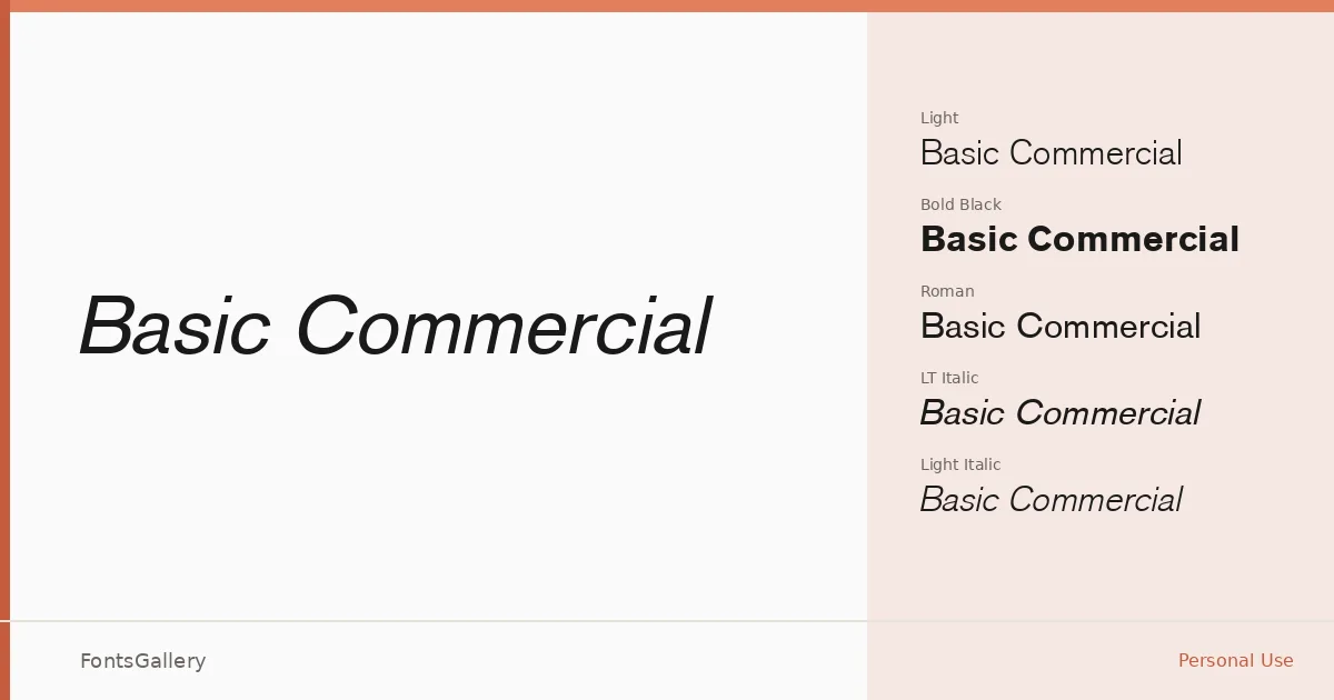
About Basic Commercial Font
There is a particular kind of restraint in this sans serif — the kind that reads as confidence rather than plainness. The letterforms sit squarely in a classic grotesque tradition: even strokes, open counters, and a neutrality that holds up across sizes without demanding attention for itself. The family is distributed through Linotype Library GmbH and is held as a trademark of Heidelberger Druckmaschinen AG.
Design Aesthetics & Character Characteristics
The family spans Light through Black in both roman and italic cuts — specifically Light, Light Italic, Roman, Italic, Bold, Bold Italic, Black, and Black Italic — giving you a genuine range from delicate text settings to heavy display work. The overall mood is minimal and professional, with a modern clarity that never tips into coldness. Delivered as TTF files with Latin coverage, the forms are consistent across the weight range in a way that makes mixing cuts within a layout feel natural rather than forced.
Recommended Usage & Font Pairing
The weight range and clean geometry make it well suited to branding systems, business cards, magazine layouts, presentations, and advertisement work where legibility and a composed, professional tone matter more than expressiveness. For pairing, the family works alongside Aranea, Ballmain, 321 Impact, Aresink, and Batoshi, each offering a different degree of contrast or personality against the measured neutrality here.
License & Usage Terms
This family is available under Personal Use terms only — commercial use is not permitted, so confirm your rights with Linotype Library GmbH before applying it to any client or commercial job. The license permits installable embedding, and full terms are available at linotypelibrary.com.