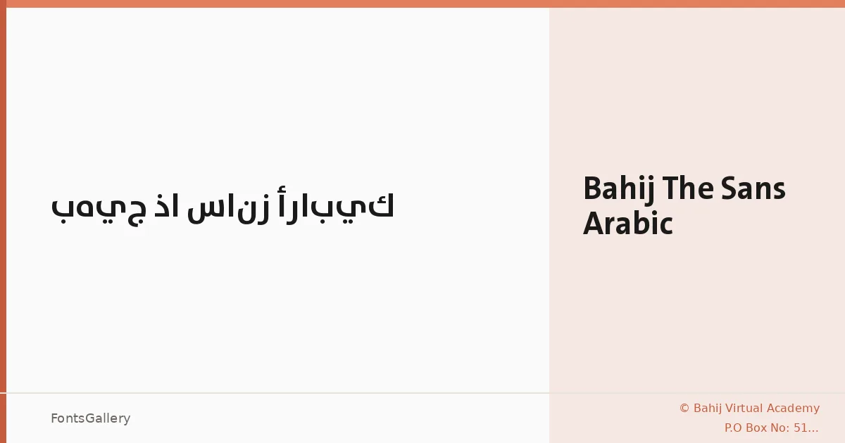
About Bahij The Sans Arabic Font
There is a measured confidence to this typeface — a clarity in both its Latin and Arabic letterforms that reads as considered rather than neutral. Brought to life by Dr. Abdul Hamid Bahij and Luc(as) de Groot under the Bahij Virtual Academy, the family was redesigned in 2013 and represents a serious effort to bridge Arabic and Latin scripts within a cohesive sans-serif structure.
Design Aesthetics & Character Characteristics
The single available cut — a Medium Bold weight delivered as a TTF — sits in that useful territory between text weight and display weight, carrying enough presence for headlines without tipping into heavy. The overall mood is modern and minimal, with a professional restraint that keeps forms functional across both script systems. There is nothing decorative here; every curve and terminal earns its place.
Recommended Usage & Font Pairing
The weight and bilingual range make it a natural fit for branding work, magazine headers, signage, website headers, and business card typography — anywhere Arabic and Latin need to share space with equal authority. For contrast, the listed pairing companions span a wide range of personalities: the editorial serif Canela, the script warmth of Armelie, the raw energy of 321 Impact, the refined geometry of ABC Arizona, and the sharp angularity of Kactigona each offer a different kind of counterpoint to its structured neutrality.
License & Usage Terms
This family is released under personal-use terms only — commercial use is not permitted, so confirm clearance before committing it to a client job. Embedding is set to editable.