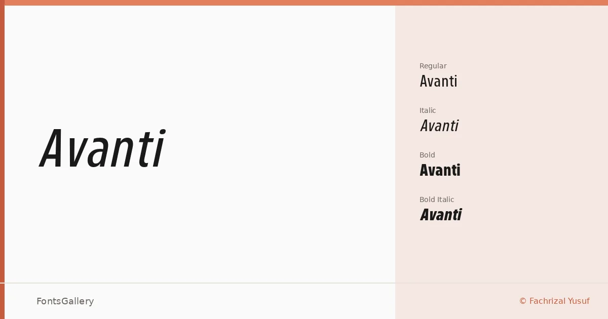
About Avanti Font
There is an economy to condensed sans serifs that rewards discipline, and this family — designed by Fachrizal Yusuf under the Glowtype banner — commits to that economy fully. The letterforms are tight and upright, built for situations where a headline needs to command space without sprawling across the measure. The condensed structure keeps things lean while the strokes maintain enough weight to hold their own at display sizes.
Design Aesthetics & Character Characteristics
The family sits squarely in the modern, minimal end of the sans serif spectrum, carrying a professional confidence that suits bold editorial and commercial work. Four cuts are available in OTF format — Regular, Italic, Bold, and Bold Italic — giving you an upright-and-slanted pair at each weight. The Bold in particular pushes toward the assertive end of the scale, while the Regular keeps enough air to breathe in smaller headline settings. Across all four, the mood stays consistent: clean, direct, and undecorated.
Recommended Usage & Font Pairing
The condensed proportions make it a natural fit for poster headlines, magazine covers, advertising campaigns, and branding work where Latin-script text needs to feel sharp and controlled. It was drawn with those high-impact, display-first contexts in mind, so it performs best when given space to be large. For pairing, the family works alongside Canela, Armelie, Minecraft, ABC Arizona, and Kactigona — a range of companions that can soften, contrast, or anchor it depending on the project.
License & Usage Terms
This is a Demo license with personal-use terms only — embedding is limited to preview and print, so confirm licensing directly with Glowtype before committing it to any commercial job.