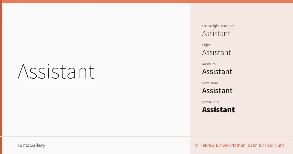
About Assistant Font
There is a quiet confidence to the letterforms here — clean, open, and unhurried. The Hebrew script was drawn by Ben Nathan, with the Latin by Paul Hunt, and the two scripts sit in genuine harmony across a shared weight range. The result is a bilingual sans-serif built from the ground up as a coherent system rather than an afterthought pairing.
Design Aesthetics & Character Characteristics
The family spans ExtraLight through ExtraBold, including a Variable font that lets you move continuously through the range — eight named instances in all, available as TTFs. The proportions are neutral without being cold, and the stroke contrast is low enough to read easily at screen sizes while retaining enough personality to hold attention in print. It reads as minimal and modern in the best sense: nothing is fussy, nothing is missing.
Recommended Usage & Font Pairing
The weight range and dual-script coverage make it a natural fit for branding work, presentations, magazine layouts, and website headers where both Latin and Hebrew need to coexist at the same typographic level. Business card typography benefits especially from the lighter cuts, while SemiBold and ExtraBold carry display lines cleanly. For editorial contrast, it pairs well with Canela or ABC Arizona; for something more expressive, Allura or Ballmain shift the register; 321 Impact adds a heavier, more abrupt counterpoint when you need it.
License & Usage Terms
Released under the SIL Open Font License, Version 1.1, which allows commercial use freely — embedding is installable, so you can embed it in documents and applications without restriction. Full license terms are at http://scripts.sil.org/OFL.