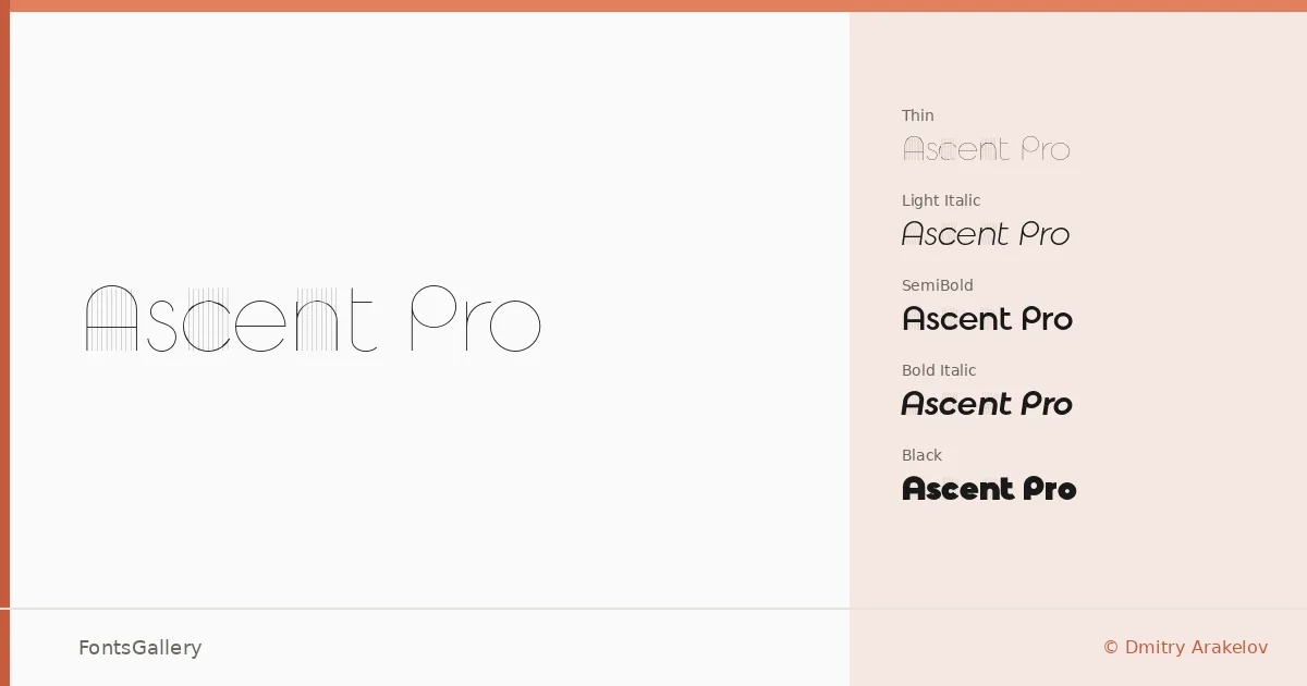
About Ascent Pro Font
There is a particular kind of restraint in a sans-serif that knows exactly how much to say — clean strokes, measured spacing, nothing added for the sake of it. Designed by Dmitry Arakelov, this family brings that quality across a wide weight range: Thin and Thin Italic through UltraLight, Light Italic, Regular, Regular Italic, SemiBold, SemiBold Italic, Bold Italic, UltraBold, UltraBold Italic, Black, and Black Italic, all delivered as OTF files. The letterforms sit comfortably in that modern, minimal register without feeling cold or generic.
Design Aesthetics & Character Characteristics
The family reads as elegant and professional in equal measure — the kind of sans that works as confidently at display scale as it does in a tight logo lockup. Moving from the Thin cuts to the heavy Black and Black Italic, the proportions hold their composure without the weight transitions feeling abrupt. That consistency is what makes the range genuinely useful across a branding system rather than just at one end of the spectrum.
Recommended Usage & Font Pairing
The best-use cases are visual and direct: magazine headlines, website headers, brand identities, and logo work where Latin-script coverage is the requirement. The weight spread gives art directors room to build hierarchy within a single family before reaching for a second face. When a companion is needed, it pairs well with AQUA, Ballmain, 321 Impact, Aranea, and Batoshi.
License & Usage Terms
This family is available under a Demo license, which means it is for personal use only — confirm licensing terms with the designer before committing it to any commercial job. Embedding is permitted at the editable level.