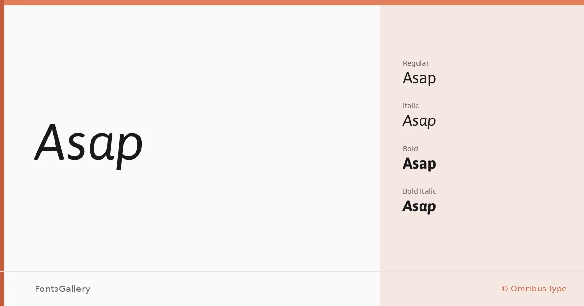
About Asap Font
Rooted in the earlier typeface Ancha, designed by Pablo Cosgaya and Hector Gatti, this sans-serif from Omnibus-Type was developed with screen and desktop legibility as a clear priority. One of its most deliberate structural decisions is standardised character width across all styles — meaning a line set in Regular will occupy the same measure when switched to Bold or Italic, a practical advantage that most workhorse families quietly fail to deliver.
Design Aesthetics & Character Characteristics
The overall mood is minimal and modern without tipping into coldness — the kind of professional neutrality that holds up under close reading in a business context. The family ships in four cuts: Regular, Italic, Bold, and Bold Italic, available in both TTF and OTF formats. That focused weight range keeps things honest: the contrast between Regular and Bold is strong enough to build clear typographic hierarchy without demanding extra styles to do the work.
Recommended Usage & Font Pairing
The standardised width behaviour makes it especially reliable for presentations and website headers, where reflow on text edits would otherwise be a nuisance. It also pulls its weight in branding, business cards, and magazine layouts where Latin-script coverage is the requirement and consistency across weights matters more than expressive range. For pairing, the family works alongside Canela, Allura, 321 Impact, ABC Arizona, and Ballmain — a varied set that suggests it can anchor both editorial and identity-driven compositions.
License & Usage Terms
Asap is released under the SIL Open Font License, Version 1.1, which permits commercial use freely; full terms and the accompanying FAQ are available at http://scripts.sil.org/OFL. Embedding is permitted at the installable level, so the files can be distributed within documents without restriction.