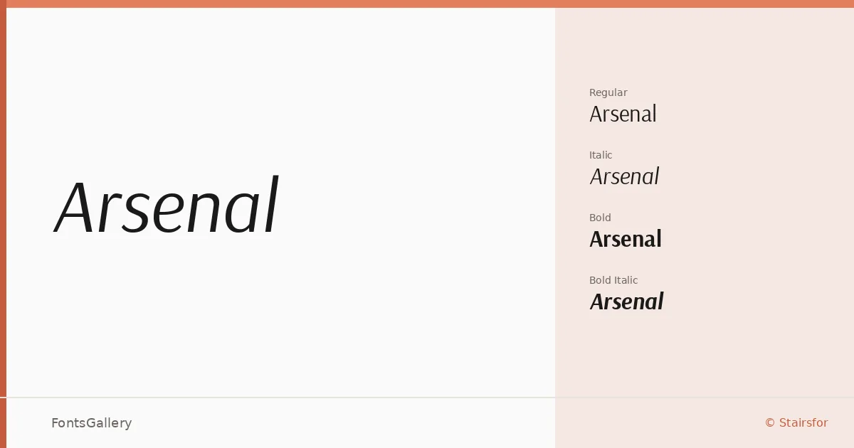
About Arsenal Font
There is a quiet confidence to these letterforms — clean strokes, open apertures, and a geometric discipline that never tips into coldness. Designed by Andrij Shevchenko under the Stairsfor foundry, the family covers Latin, Vietnamese, and Cyrillic scripts, making it genuinely useful across a wide range of languages without compromise to its character.
Design Aesthetics & Character Characteristics
This is a sans serif that sits comfortably in the modern and minimal register — professional without being corporate, elegant without being decorative. The family ships in four TTF cuts: Regular, Italic, Bold, and Bold Italic. That tight, focused set is actually a strength: the contrast between the Regular and Bold is well-judged, and the italics carry enough personality to earn their place rather than simply slanting the upright forms. In use, the texture is even and the spacing generous, which keeps things readable at small sizes as readily as it does at display scale.
Recommended Usage & Font Pairing
The combination of minimal structure and professional mood makes it well-suited to branding systems, business cards, magazine layouts, presentations, and website headers — anywhere a clean, authoritative voice is needed without visual noise. For pairing, the family works alongside Canela, ABC Arizona, and Armelie when you want to introduce contrast through a serif or script companion, and alongside 321 Impact or Kactigona when the job calls for something with more expressive weight at display sizes.
License & Usage Terms
Arsenal is released under the SIL Open Font License, Version 1.1, which permits commercial use and installable embedding — full terms and FAQ are available at http://scripts.sil.org/OFL.