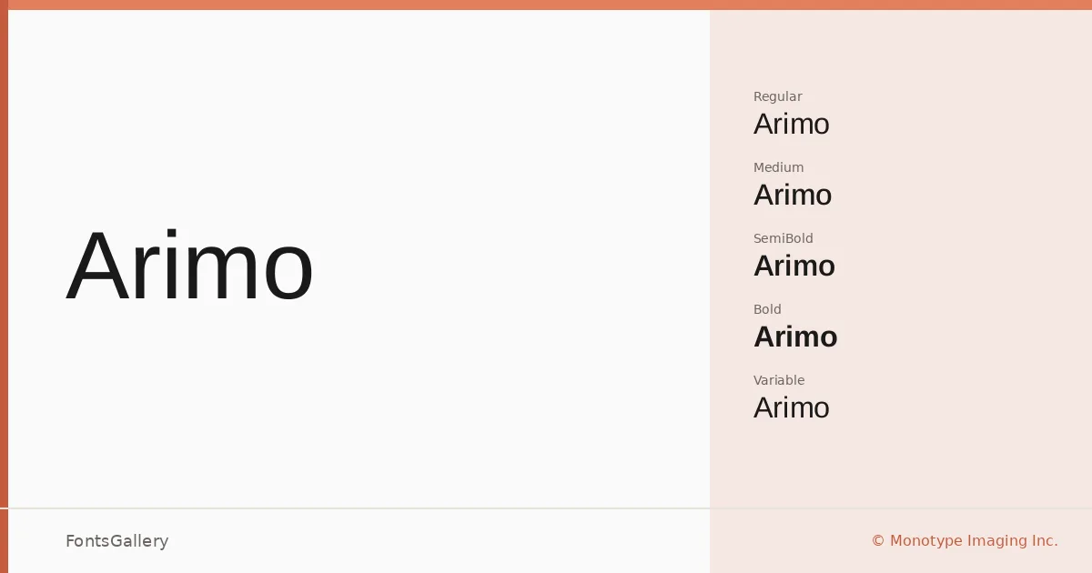
About Arimo Font
There is a deliberate restraint to these letterforms — clean strokes, open apertures, and a rhythm that stays out of its own way. Steve Matteson of Monotype Imaging Inc. designed Arimo as a metrically compatible alternative to Arial, which means documents swap between the two without reflowing, a practical detail that matters enormously in cross-platform workflows. The character set reaches well beyond basic Latin, covering Latin Extended, Vietnamese, Cyrillic, Greek, Hebrew, and partial Coptic.
Design Aesthetics & Character Characteristics
This is a sans serif built on classic proportions but tuned for modern screens, sitting comfortably in the minimal and professional range of the spectrum. The family spans Regular, Italic, Medium, Medium Italic, SemiBold, SemiBold Italic, Bold, and Bold Italic, plus Variable and Variable Italic cuts — giving you a continuous weight axis to work with in environments that support it. All files are TTF with installable embedding permissions. On screen, spacing and hinting are handled with enough care that body text holds up at small sizes without feeling pinched.
Recommended Usage & Font Pairing
The weight range and clean structure make it a natural choice for business branding, presentation decks, website headers, and editorial work where the type needs to read quickly and carry authority without decoration. Magazine layouts benefit from the contrast between the lighter and heavier cuts, while business card use rewards the tight, professional spacing at small sizes. It pairs well with the calligraphic warmth of Armelie, the editorial weight of Canela, or the display energy of 321 Impact, AQUA, and Kactigona when contrast is the goal.
License & Usage Terms
Arimo is released under the SIL Open Font License, Version 1.1, which allows commercial use — full terms and the accompanying FAQ are at https://openfontlicense.org.