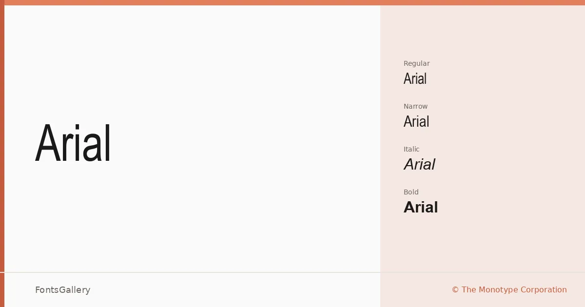
About Arial Font
Few sans-serifs have shaped the visual language of modern documents as quietly and thoroughly as this one. Drawn by Robin Nicholas and Patricia Saunders at The Monotype Corporation in 1982, it carries a clean geometric neutrality that reads without friction at almost any size. The letterforms are humanist enough to avoid coldness but rational enough to disappear into a layout — which is exactly the point.
Design Aesthetics & Character Characteristics
This is a classic, minimal sans-serif with a professional bearing and a thoroughly modern construction. The family ships in TTF format across four distinct cuts: a geometric italic (Geo_Arial Italic), a condensed narrow (Arial Narrow), a thin regular weight (Arial Th), and a bold geo variant (Arial GEO Bold). That range — from hair-thin to bold, upright to condensed — gives the family enough span to cover both running text and display work without reaching for a second face. The strokes are even, the terminals clipped, and the spacing tuned for both screen rendering and print output.
Recommended Usage & Font Pairing
The combination of classic structure and minimal detail makes it a natural choice for business cards, magazine layouts, presentations, signage, and website headers. Script coverage extends across Latin, Cyrillic, Greek, and Georgian, so multilingual publications and international brand work are well within reach. For pairing, the family sits comfortably alongside Canela, ABC Arizona, Armelie, 321 Impact, and Kactigona — contrasting serif or display weights that give the overall system some warmth or edge.
License & Usage Terms
This family is available under Personal Use terms — confirm licensing before any commercial job. Embedding is permitted at the editable level, within the boundaries described in the EULA; the license notes also specify that temporary download to a printer or output device for printing content is allowed.