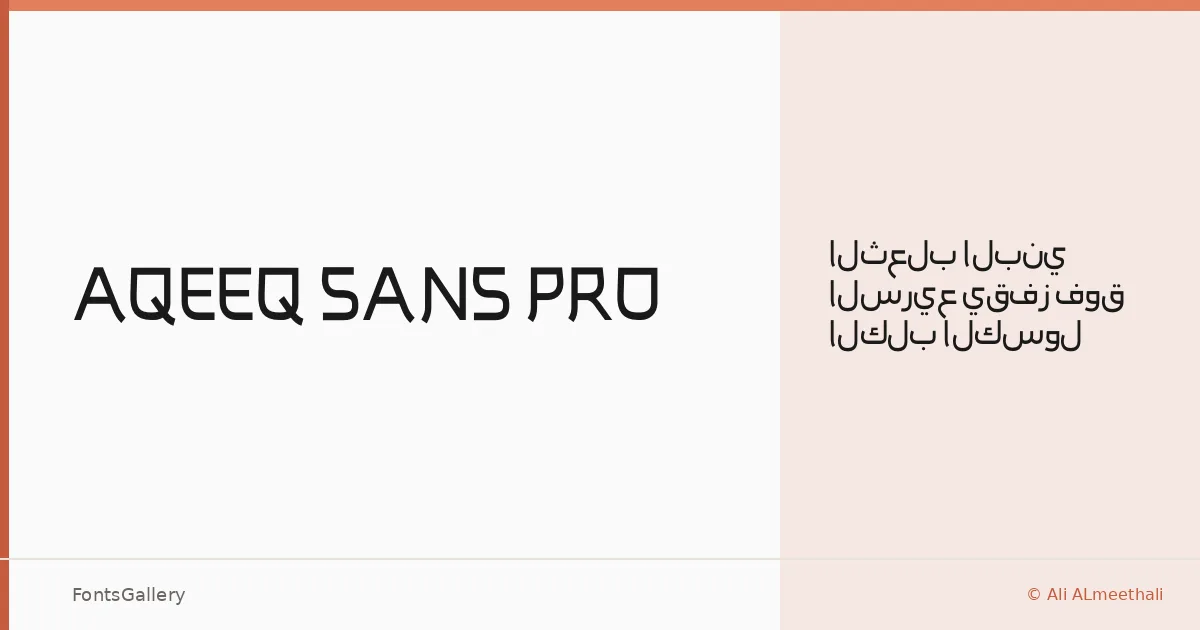
About AQEEQ SANS PRO Font
There is a clean restraint to this sans-serif that announces itself immediately — no flourishes, no unnecessary contrast, just geometry held in careful balance. It was designed by Ali ALmeethali under the Atype Studio banner, and the single Regular weight delivers that restraint with consistency across its character set. The forms read as deliberately stripped back, leaning into space rather than filling it.
Design Aesthetics & Character Characteristics
The overall mood sits squarely in futuristic and minimal territory, with the kind of professional composure that holds up under enlargement. Available as a single Regular cut in OTF format, it is built to carry weight through scale and spacing rather than through style variation. At display sizes the geometry becomes the voice — rational, modern, unhurried.
Recommended Usage & Font Pairing
Its strengths show most clearly in branding, logo work, signage, and website headers — contexts where a headline needs to land without embellishment. The character set covers Latin, Latin Extended (partial), Vietnamese, and Arabic, which broadens its reach meaningfully for multilingual identities and campaigns. For contrast in a layout, the listed pairing options — Canela, Armelie, 321 Impact, ABC Arizona, and Kactigona — each offer a different kind of tension against its clean geometry, from editorial warmth to expressive weight.
License & Usage Terms
This family is released under Personal Use terms by Atype Studio, which means commercial use is not permitted — confirm licensing directly with the rights holder before taking it into any client or commercial job. Embedding is set to installable.