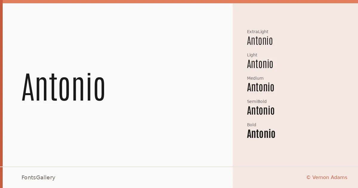
About Antonio Font
There is a tautness to this sans — a condensed, upright posture that commands space without crowding it. Designed by Vernon Adams, it carries the clean geometry you expect from a modern display face, but with proportions that feel deliberate rather than mechanical. The letterforms are drawn with a restrained hand: no unnecessary curvature, no decorative inflection, just structure.
Design Aesthetics & Character Characteristics
Antonio sits squarely in the minimal and professional end of the sans serif spectrum, built for settings where weight and clarity do the work. The family spans Thin and ExtraLight through Light, Regular, Medium, SemiBold, and Bold, with a Variable file included alongside the TTF cuts — giving you smooth interpolation across the full range in a single file. Even at lighter weights the face holds its composure; at Bold it reads with the confidence of a headline that doesn't need to shout. The overall mood is modern without being cold, direct without being blunt.
Recommended Usage & Font Pairing
The family is built for high-visibility Latin-script work: poster headlines, magazine folios, logo lockups, and branding contexts where a condensed sans needs to carry real authority. The weight range makes it equally useful for a bold campaign header or a lighter subheading treatment on the same layout. It pairs well with Canela, ABC Arizona, and Armelie for editorial contrast, and can hold its own alongside Kactigona or Minecraft when the job calls for something with more character in the supporting role.
License & Usage Terms
Released under the SIL Open Font License, Version 1.1, which permits commercial use freely — embedding is set to installable, so you can distribute it within documents and applications without restriction.