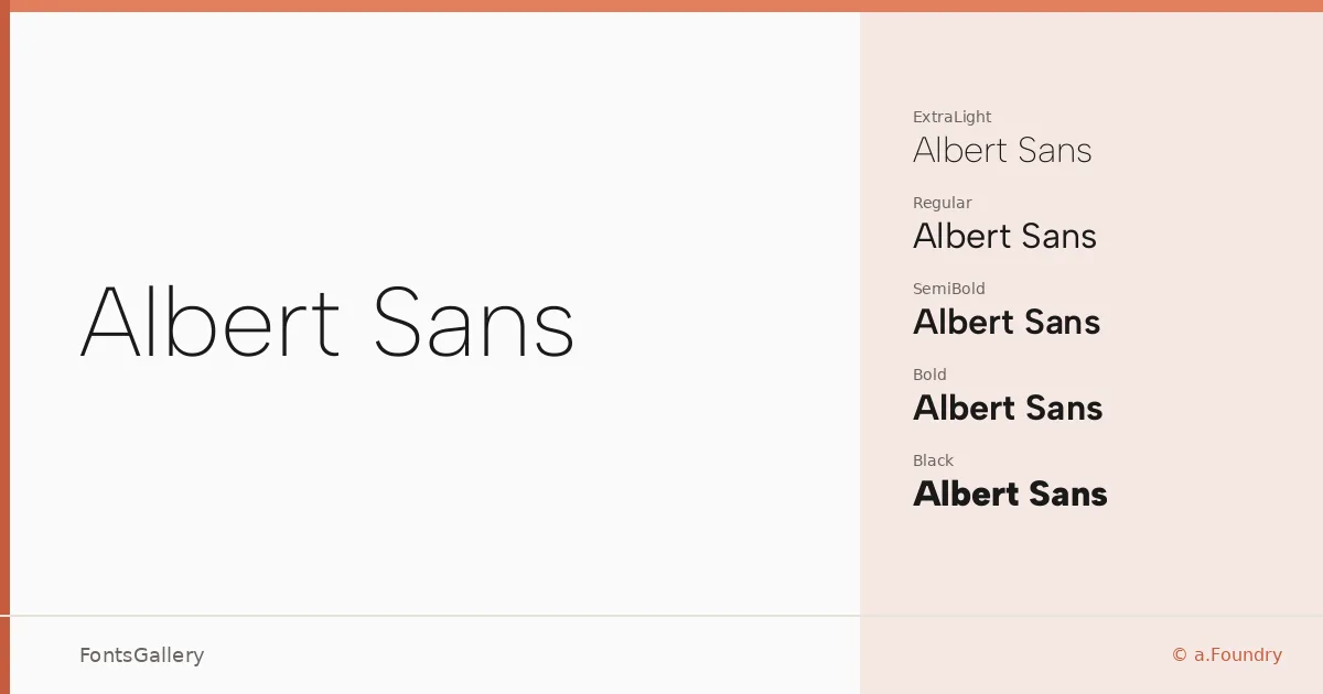
About Albert Sans Font
There is a cleanness to these letterforms that comes from genuine restraint — no decorative quirks, no apology for being geometric, just well-considered proportions that hold up at a caption size and across a full-bleed header alike. Andreas Rasmussen designed this family under the a.Foundry banner, and the Latin coverage is handled with the kind of consistency you notice only when it is absent. The result is a sans that earns its neutrality rather than inheriting it from convention.
Design Aesthetics & Character Characteristics
The family spans an unusually complete range — Thin and ExtraLight at the airy end, through Light, Regular, Medium, and SemiBold, all the way to Bold, ExtraBold, and Black — each weight accompanied by a corresponding italic. Variable and Variable Italic cuts are also included, giving you continuous control across the axis in a single TTF file. The overall mood is minimal and modern, with strokes that stay rational and open apertures that keep text readable under pressure. It carries a professional composure without feeling stiff.
Recommended Usage & Font Pairing
The weight range makes it particularly suited to branding systems, where you might need a hairline logotype, a medium-weight business card, and a bold website header all speaking the same voice. Magazine layouts and presentation decks benefit from the same consistency — the heavier cuts command attention while the lighter ones recede gracefully into supporting roles. For contrast-driven pairings, it works well alongside the serif warmth of Canela, the script character of Armelie, the display energy of 321 Impact, the personality of AQUA, or the boldness of Kactigona.
License & Usage Terms
Albert Sans is released under the SIL Open Font License, Version 1.1, which explicitly permits commercial use — full details and the accompanying FAQ are available at https://scripts.sil.org/OFL. The embedding permission is set to installable, so you can embed it in documents and applications without restriction.