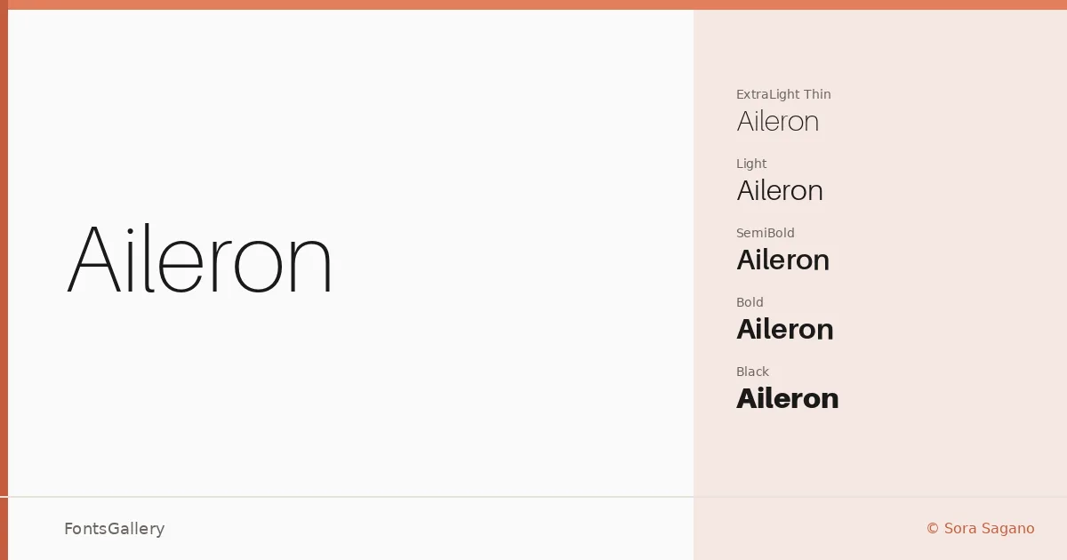
About Aileron Font
There is a clarity to this sans-serif that announces itself immediately — the strokes are clean, the spacing considered, and nothing competes for attention. Sora Sagano designed it as a geometric neo-grotesque, drawing clear influence from the rational European sans-serif tradition without feeling derivative. The result is a family that reads with quiet confidence at any size.
Design Aesthetics & Character Characteristics
The family spans a remarkably full range, running from Thin and UltraLight at the delicate end through Light, Regular, SemiBold, Bold, Black, and Heavy — each with a matching italic — giving you sixteen cuts in total, all delivered as OTF files. The mood sits firmly in minimal and modern territory: terminals are clean, curves are controlled, and the proportions stay professional without feeling stiff. That even weight distribution across the range means transitions between styles feel graduated rather than abrupt, which matters when you are mixing weights in a layout.
Recommended Usage & Font Pairing
The design earns its keep in branding work, business card typesetting, magazine layouts, and website headers — anywhere that a composed, contemporary Latin-script face needs to carry the load without decoration. For pairing, it has been matched well with Aranea, Ballmain, 321 Impact, Aresink, and Batoshi, each of which offers enough contrast in texture or personality to give a layout some tension.
License & Usage Terms
Aileron is released under Personal Use terms, which means you should confirm licensing before applying it to any commercial job. Embedding is permitted at an editable level, and the copyright is listed as No Rights Reserved.