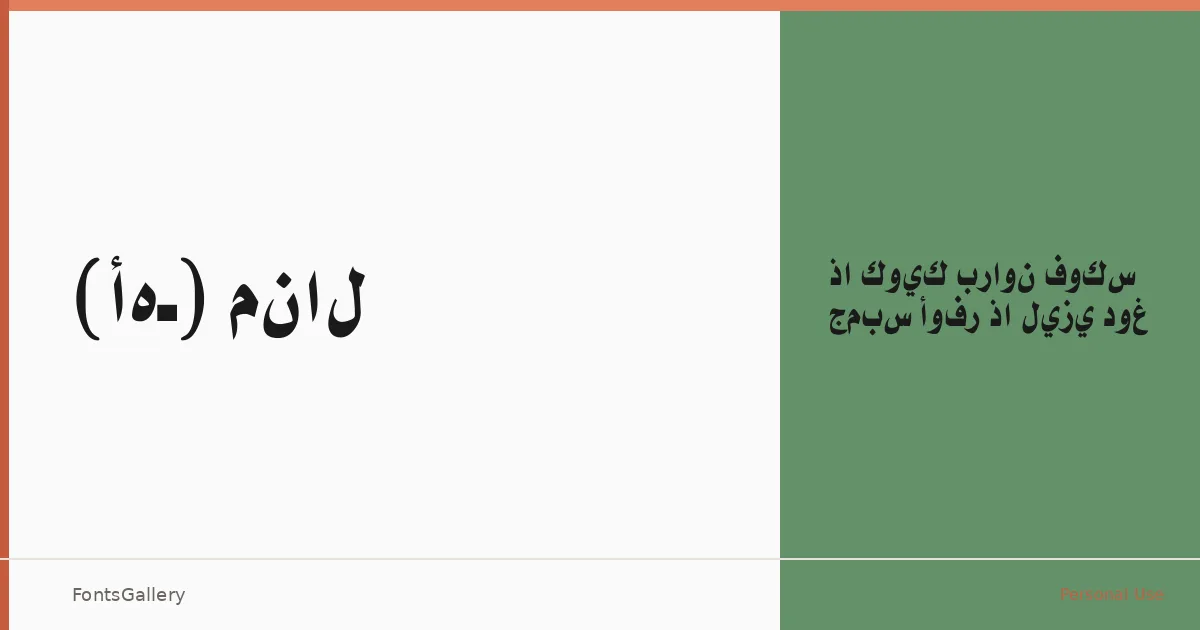
About (AH) Manal Font
There is a deliberate weight to these letterforms — the kind of mass that makes a headline sit with authority rather than merely occupy space. Created by Eng. Hasan Abu Afash, this sans serif covers both Latin (partial) and Arabic, a bilingual reach that shapes every decision in the design. The single style, Black — Medium Regular, is built around that contrast: dense, dark forms that hold their ground at large sizes.
Design Aesthetics & Character Characteristics
This is a bold, minimal sans serif with a modern and professional character. The Black — Medium Regular weight leans into geometry and restraint — there is no decoration here, just clean strokes and confident proportions. Delivered as a TTF, it reads as a display face at heart, one that suits contexts where brevity and visual impact do the communicating. The Arabic and Latin glyphs share the same purposeful economy of form.
Recommended Usage & Font Pairing
The family earns its place in branding systems, logo lockups, presentation decks, and social media graphics where a headline needs to register immediately — particularly in bilingual Arabic and Latin contexts. For contrast, it has been paired with the editorial curves of Canela and ABC Arizona, the expressive strokes of Allura and Vintage Melinda, and the raw impact of 321 Impact, giving you a wide range of tonal combinations to explore.
License & Usage Terms
This family is released under a Personal Use license; commercial use is not permitted, so confirm clearance before applying it to any client or revenue-generating work. Embedding is permitted at the editable level within documents.