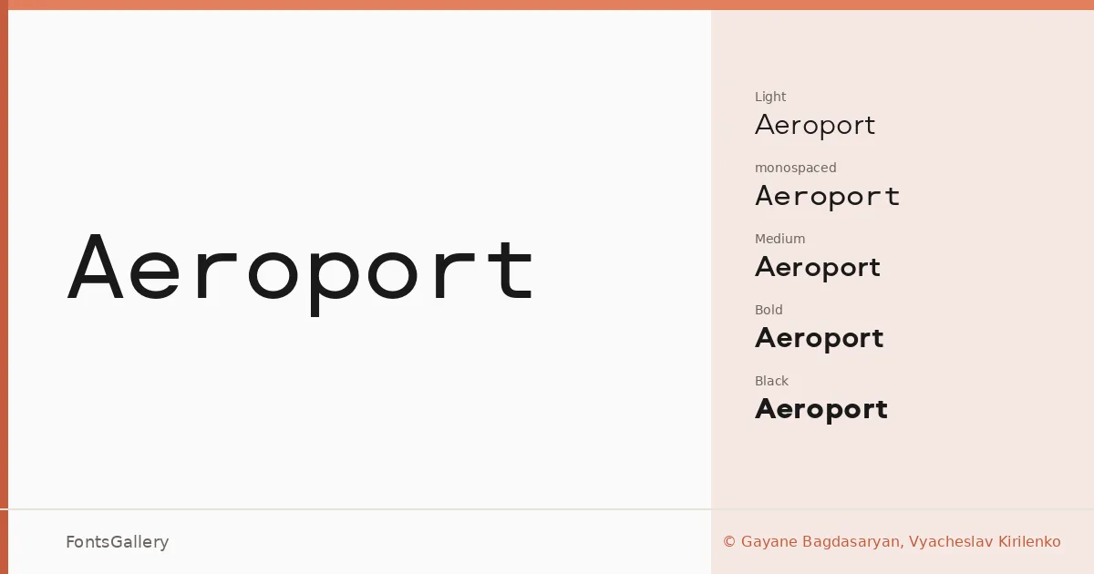
About Aeroport Font
There is a clean, almost architectural stillness to these letterforms — the kind of geometric restraint that comes from deliberate decisions rather than default settings. The family was designed by Gayane Bagdasaryan and Vyacheslav Kirilenko, and it spans Latin and Cyrillic scripts, making it genuinely useful across a broad range of editorial and identity work where both writing systems appear together.
Design Aesthetics & Character Characteristics
This is a modern, minimal sans serif built around professional clarity and elegant proportion. The family runs from Light and Light Italic through Regular, Medium, Bold, and on up to Black, with corresponding italics at each weight — plus a monospaced Regular cut for settings where fixed-width spacing matters. In use, the forms hold their composure at large display sizes without feeling cold, and they carry enough structure at smaller settings to stay legible in body runs. All styles are delivered as OTF files.
Recommended Usage & Font Pairing
The range of weights makes it well suited to branding systems, logo lockups, magazine layouts, website headers, and environmental signage — anywhere that demands consistency across both Latin and Cyrillic copy. For contrast pairings, the designers suggest combining it with serif and display faces such as Canela or Times New Roman, with script faces like Angeletta or Magnolia Script, or with the expressive sans Dharma Gothic E.
License & Usage Terms
This family is available under a Demo license — commercial use is not permitted, and any use without permission from Gayane Bagdasaryan and Vyacheslav Kirilenko is prohibited; confirm terms at brownfox.org/licence/ before taking it into a paid project. Embedding is restricted to preview and print only.