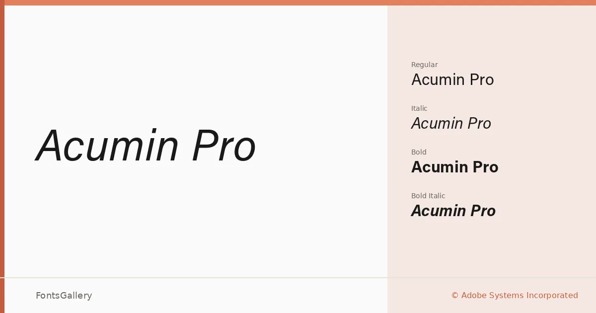
About Acumin Pro Font
Robert Slimbach's neo-grotesque for Adobe Systems Incorporated sits at the quieter end of the sans-serif spectrum — its stroke contrast is nearly imperceptible, its terminals cut clean, and its spacing holds an evenness that rarely calls attention to itself. That restraint is precisely the point. The result is a face designed to carry a reader through text without friction, while remaining composed and assured at display sizes.
Design Aesthetics & Character Characteristics
The family arrives in four cuts — Regular, Italic, Bold, and Bold Italic — delivered as OTF files. The mood is consistently minimal and professional: upright strokes that feel classical in their proportions but modern in their geometry, with none of the quirks that make some grotesques polarizing. The italic is a genuine oblique with enough refinement to work as an accent rather than a workaround, and the Bold holds its weight without crowding the counters.
Recommended Usage & Font Pairing
The type works naturally in branding systems, business cards, magazine layouts, presentation decks, and website headers — anywhere the writing itself needs to lead rather than the letterforms. Latin and Vietnamese text are both well supported, making it a practical choice when those two scripts share a layout. For pairing, it holds up well alongside contrasting voices such as Canela, ABC Arizona, Armelie, Kactigona, and 321 Impact, where its neutrality gives a secondary face room to breathe.
License & Usage Terms
This family is offered under Personal Use terms — commercial use is not permitted under this license, so confirm clearance before taking it into a client project or commercial production. Embedding is permitted at the editable level; full terms are available at the license URL on file.