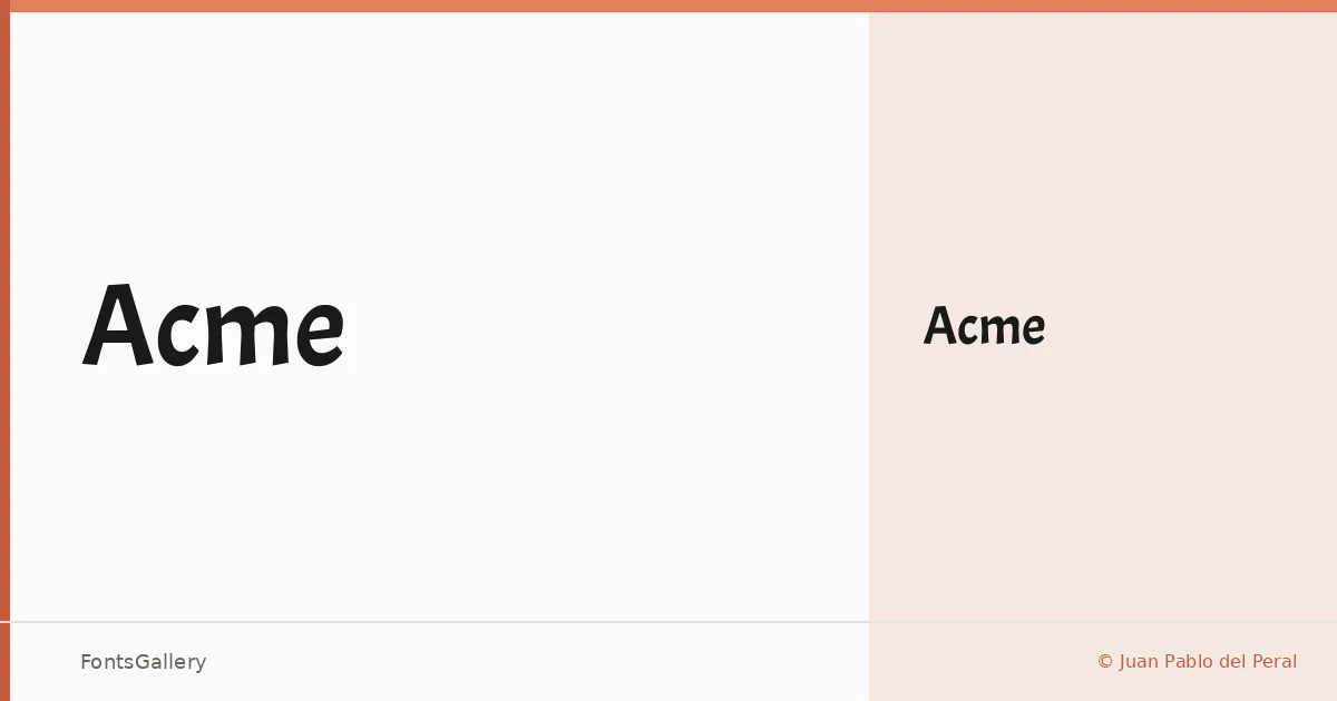
About Acme Font
There is a directness to this sans serif that announces itself immediately — the strokes are confident, the proportions built for impact rather than extended reading. It comes from designer Juan Pablo del Peral, whose work can be found at huertatipografica.com.ar. The single Regular weight has been drawn with enough structural authority that it holds its own at large sizes without leaning on additional weights for support.
Design Aesthetics & Character Characteristics
The overall mood sits squarely in modern and professional territory, with letterforms that carry a boldness in their presence even at their one available weight — Regular, delivered in TTF format. The geometry feels deliberate rather than cold, making it well-suited to contexts where clarity and a strong visual voice need to coexist. It covers Latin script.
Recommended Usage & Font Pairing
This is a face that earns its place in headline work, posters, advertisements, and logo and branding applications where the type needs to hold a composition together at a glance. For contrast in a layout, it pairs well with Canela or Times New Roman on the serif side, the expressive Magnolia Script or Angeletta for warmth, and Dharma Gothic E when you want to stay in high-impact display territory.
License & Usage Terms
Acme is released under the SIL Open Font License (OFL), Version 1.1, which permits commercial use and includes installable embedding permissions — the full terms and FAQ are available at http://scripts.sil.org/OFL.