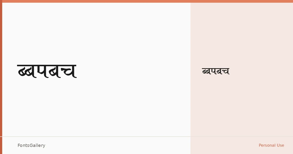
About Aakar Font
There is a quiet economy to this sans serif — clean strokes, minimal contrast, and nothing borrowed from decoration. The single Regular weight is generated via Fontographer 4.1.5, and it carries the kind of restrained geometry that tends to disappear into a layout in the best possible way.
Design Aesthetics & Character Characteristics
Squarely in the sans serif category, it reads as modern and professional without leaning on any particular historical reference. The sole Regular cut keeps things honest: what you see is a face built for clarity rather than character, which makes it surprisingly useful in contexts where the type needs to support content rather than compete with it. It ships as a TTF and covers Latin script, though only partially, so extended Latin character sets should be checked against your copy before committing.
Recommended Usage & Font Pairing
Its minimal, professional tone makes it a natural fit for presentation decks, website headers, signage, and editorial contexts where a clean modern headline face is needed. For contrast in a layout, it has been paired with Canela, ABC Arizona, and Armelie — faces that bring warmth or editorial texture — and with 321 Impact and Kactigona when something with more visual weight is called for at display sizes.
License & Usage Terms
Aakar is available under Personal Use terms, which means commercial use is not permitted — confirm licensing before taking it into any client or revenue-generating work. The embedding permission is set to installable.