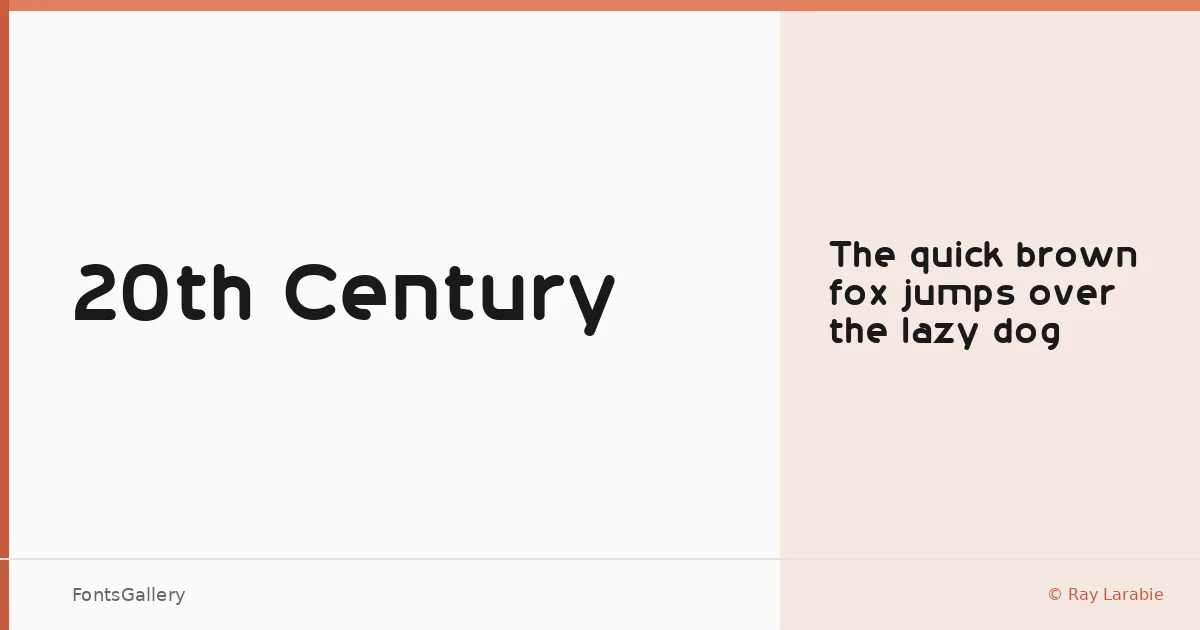
About 20th Century Font
There is a clean, deliberate economy to this sans serif — the kind of geometry that doesn't waste a curve. Ray Larabie designed it as freeware, and the single Regular weight is delivered as a TTF file, no frills attached. What it offers is a face that reads as confident and uncluttered, with letterforms that lean into the modern and minimal without feeling cold.
Design Aesthetics & Character Characteristics
This is a sans serif with a professional, almost architectural composure — bold in presence even at a single weight, stripped of decorative distraction. The Regular cut holds its ground in large settings, where the geometry of each letter has room to register. The mood sits somewhere between editorial restraint and the kind of graphic directness you need for branding work or a poster that has to land fast.
Recommended Usage & Font Pairing
It earns its keep at display sizes — headline treatments, magazine covers, poster type, website headers, and logotype lockups where clarity matters more than warmth. For pairing, it contrasts well against the editorial softness of Canela or the classical authority of Times New Roman, and it sits interestingly alongside the decorative personality of Angeletta or Armelie. Minecraft offers a more unexpected, textural counterpoint if the project calls for something less conventional.
License & Usage Terms
This family is released under Personal Use terms, which means it is not cleared for commercial work — confirm your rights before taking it into a client project. Embedding is restricted under the current license.