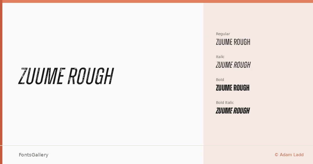
About Zuume Rough Font
There is a deliberate rawness to these letterforms — edges that catch the light unevenly, strokes that carry the texture of something pressed and worn rather than drawn clean. Adam Ladd designed this display family to sit at the intersection of grunge energy and modern confidence, and the roughened surface treatment gives every character a physical weight that smooth type simply cannot fake.
Design Aesthetics & Character Characteristics
The family arrives in four cuts — Regular, Italic, Bold, and Bold Italic — all delivered as OTF files. The mood is bold and vintage without tipping into pastiche: the underlying skeleton is tight and contemporary, and the distressed finish feels intentional rather than accidental. In the Bold, the forms carry enough mass that they hold their own at large sizes without collapsing into noise.
Recommended Usage & Font Pairing
This is a family built for high-impact work: headlines, posters, logos, branding systems that need a rough-hewn edge, and T-shirt graphics where the texture reads as authenticity. For contrast pairings, it has been recommended alongside Canela and Etna for editorial warmth, Helvetica and Bahnschrift for a clean structural counterpoint, and AQUA when you want something with more display drama beneath it.
License & Usage Terms
The files here are offered under a Demo license, which means personal-use terms only — confirm usage rights and complete a purchase before taking this into any commercial job, and direct licensing questions directly to Adam Ladd at [email protected].