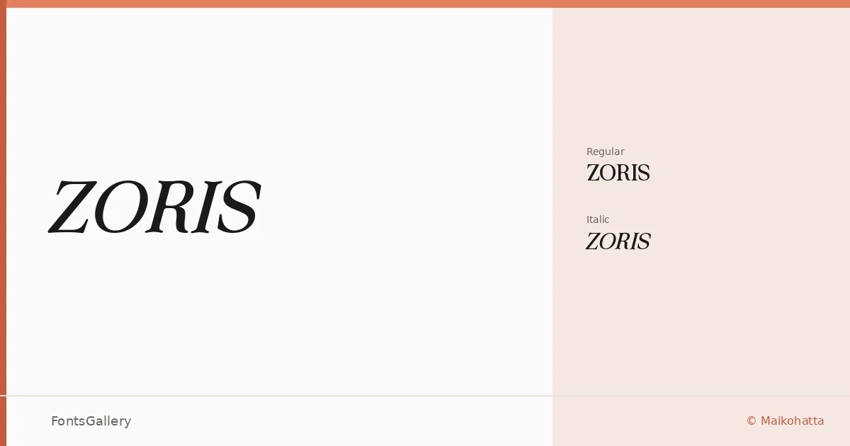
About ZORIS Font
There is a particular composure to these serifs — the kind that comes from letterforms drawn with deliberate restraint rather than decoration for its own sake. Maikohatta's work here sits in the territory where classical structure meets a cleaner, more contemporary sensibility, giving the type a quiet authority that holds up at display sizes.
Design Aesthetics & Character Characteristics
The family arrives in two cuts: a Regular and a Regular Italic, both available in TTF and OTF formats. The upright carries the elegant, luxury-leaning character you'd expect from a well-constructed display serif — controlled stroke contrast, bracketed serifs that feel grounded without being heavy. The italic softens that formality just enough to give you a second voice within the same palette, useful when a headline needs a moment of emphasis or a logotype wants a slight lean.
Recommended Usage & Font Pairing
The forms are built for branding, logo work, magazine editorial, poster headlines, and website headers — anywhere Latin-script type needs to project confidence without shouting. It sits well alongside neutral companions like Helvetica and Asap, which let the serif carry the atmosphere, and pairs with more characterful faces like Armelie, Etna, and Kactigona when the design calls for contrast between two distinct personalities.
License & Usage Terms
ZORIS is offered under a Personal Use license, which does not permit commercial use — confirm licensing terms directly with the designer before committing it to a client project. Embedding is permitted at the installable level.