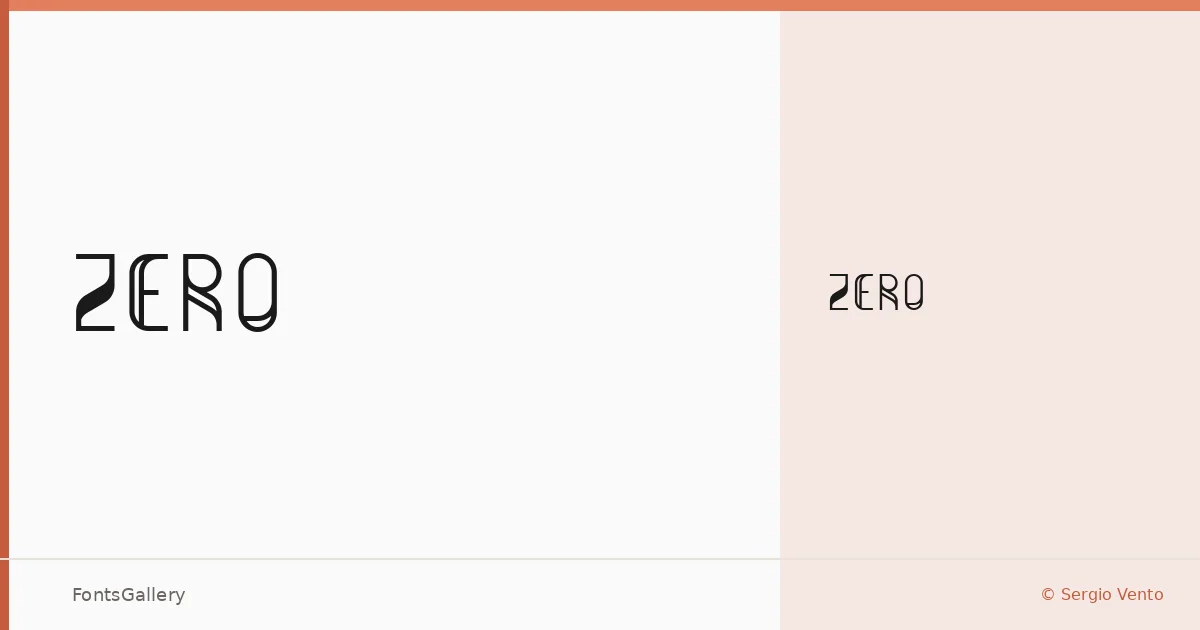
About Zero Font
There is a rawness to this display face that you notice immediately — strokes that feel deliberately stressed, letterforms that sit somewhere between industrial stencil and grunge experiment. It comes from Sergio Vento, and it arrives as a single cut: Zero Regular.
Design Aesthetics & Character Characteristics
The category is Display, and the mood leans hard into futuristic and grunge territory simultaneously — a combination that sounds contradictory until you see it working. The forms carry a bold, modern energy without softening into the generic. Because there is only one style in the family, the TTF file does one thing and commits to it fully, which is often exactly what a headline face needs to do.
Recommended Usage & Font Pairing
This is a face built for high-impact contexts: posters, logos, branding identities with an edge, and T-shirt graphics where the letterforms need to hold up at large scale and carry attitude on their own. For pairing, the mechanical neutrality of Bahnschrift or Helvetica gives the surrounding copy a clean counterpoint, while Times New Roman or Canela introduce a deliberate tension between the gritty display and something more refined — Etna is another option when you want a companion with its own structural character.
License & Usage Terms
This family is available for commercial use under its stated license terms. Note that embedding is permitted for preview and print only, so factor that in when preparing documents or interactive files.