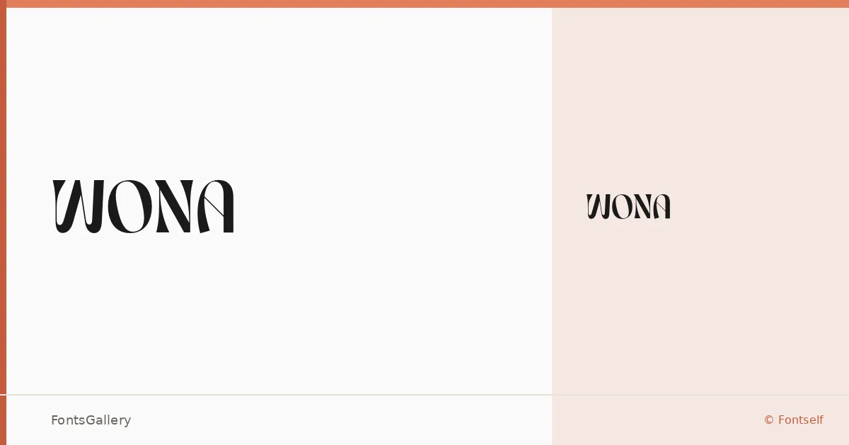
About WONA Font
There is a deliberate weight to these letterforms — a confidence in the strokes that reads as luxury without trying too hard. WONA is a single-weight display typeface released by SelarasWP through Fontself, built around a bold, elegant character that feels at home in high-end visual contexts. The Latin character set is tight and purposeful, with nothing extraneous in the design.
Design Aesthetics & Character Characteristics
This is a display face in the modern luxury register — the kind of type that commands attention at large sizes without shouting. Available as a single Regular cut in OTF format, it carries a boldness that leans elegant rather than aggressive, making the forms feel considered and self-assured. At headline scale, the letterforms project a mood that suits polished, brand-conscious work.
Recommended Usage & Font Pairing
The face earns its keep in branding systems, magazine mastheads, poster hierarchies, and logo lockups where Latin text needs presence and restraint in equal measure. For contrast in a layout, it pairs well with the delicate structure of Canela or the rational neutrality of Helvetica and Bahnschrift; for a bolder compositional play, Etna, AQUA, or a similar display companion can hold its own alongside it.
License & Usage Terms
This family is released under Personal Use terms by SelarasWP — commercial use is not permitted, so confirm the appropriate license directly at SelarasWP.com before taking it into client or commercial work. Embedding is set to installable.