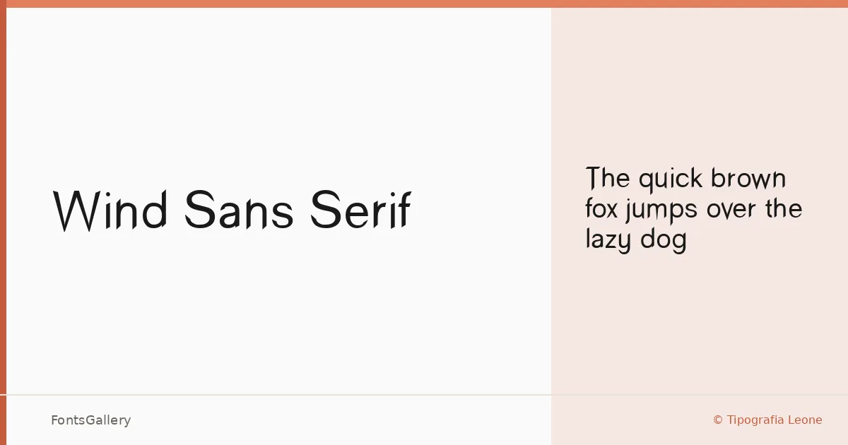
About Wind Sans Serif Font
There is a quietness to this typeface that earns attention rather than demands it. Released by Tipografia Leone, it arrives as a single Regular cut — clean, upright, and restrained in the way that the best workhorse sans serifs tend to be. The letterforms carry a classic geometry without feeling cold, sitting comfortably in that space between minimal and professional.
Design Aesthetics & Character Characteristics
This is a sans serif built around simplicity and clarity. The single Regular weight means it lives or dies by the quality of its proportions, and they hold up: the spacing feels considered, the stroke contrast is close to zero, and the overall texture reads as modern without being trendy. It ships as a TTF file, covering the Latin character set. You get one style to work with, so the design work is yours to do — which suits branding and logo contexts well, where a single well-drawn weight often beats a crowded family.
Recommended Usage & Font Pairing
The minimal, professional character makes it a natural fit for business cards, logo lockups, website headers, and magazine folios where restraint is an asset. It pairs with contrasting personalities well — the editorial warmth of Canela, the decorative stroke of Armelie, the impact-driven weight of 321 Impact, the structured geometry of AQUA, or the distinctive character of Kactigona each offer a counterpoint that gives a layout more range than the sans achieves alone.
License & Usage Terms
Wind Sans Serif is released as Freeware and is available for commercial use, with installable embedding permitted.