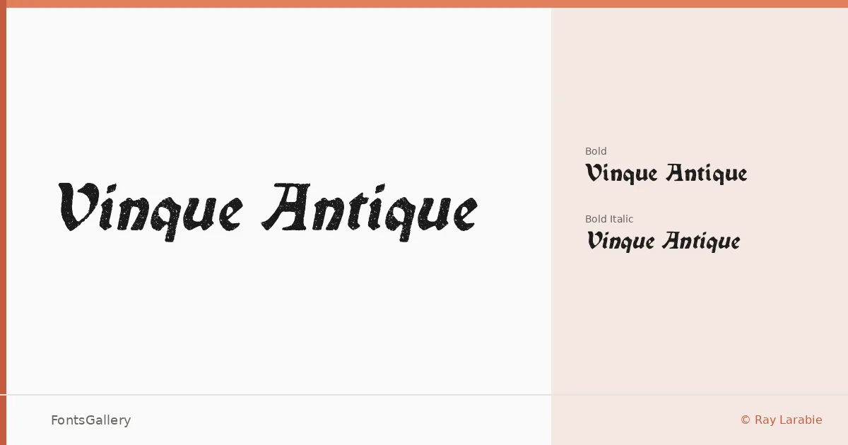
About Vinque Antique Font
There is a particular tension in a well-drawn blackletter — the thick strokes carry genuine weight, and the hairlines feel genuinely fragile beside them. Ray Larabie, working under Typodermic Fonts Inc., has built that tension into this family deliberately, delivering a face that reads as both grunge-worn and classically structured. The letterforms draw on historical blackletter conventions while carrying enough roughness at the edges to feel lived-in rather than archival.
Design Aesthetics & Character Characteristics
The family ships in two cuts — Bold and Bold Italic — as OpenType files, which keeps the offering tight and purposeful. The italic doesn't just slant the upright; it adds a second angle of energy that suits display work where momentum matters. The overall mood lands somewhere between vintage broadside and contemporary editorial provocation, equally at home in a bold, classic setting or a deliberately grungy one. Coverage extends across Latin, Vietnamese, Cyrillic, and Greek, which is an unusually broad reach for a blackletter of this style.
Recommended Usage & Font Pairing
The weight and character of these cuts make them natural choices for book covers, posters, logos, and T-shirt design — anywhere a strong period voice is needed without tipping into pastiche. Branding work that wants an aged, authoritative tone will find the Bold particularly useful as a headline or lockup element. For contrast pairings, the listed companions — Etna, Canela, Helvetica, ABC Arizona, and Bahnschrift — each offer clean geometric or humanist counterweights that let the blackletter breathe without competing with it.
License & Usage Terms
Vinque Antique is available under Personal Use terms, which means commercial use is not permitted — confirm licensing with Typodermic Fonts Inc. before applying it to any client or revenue-generating work. Embedding is restricted to preview and print only.