About Vertigo Font
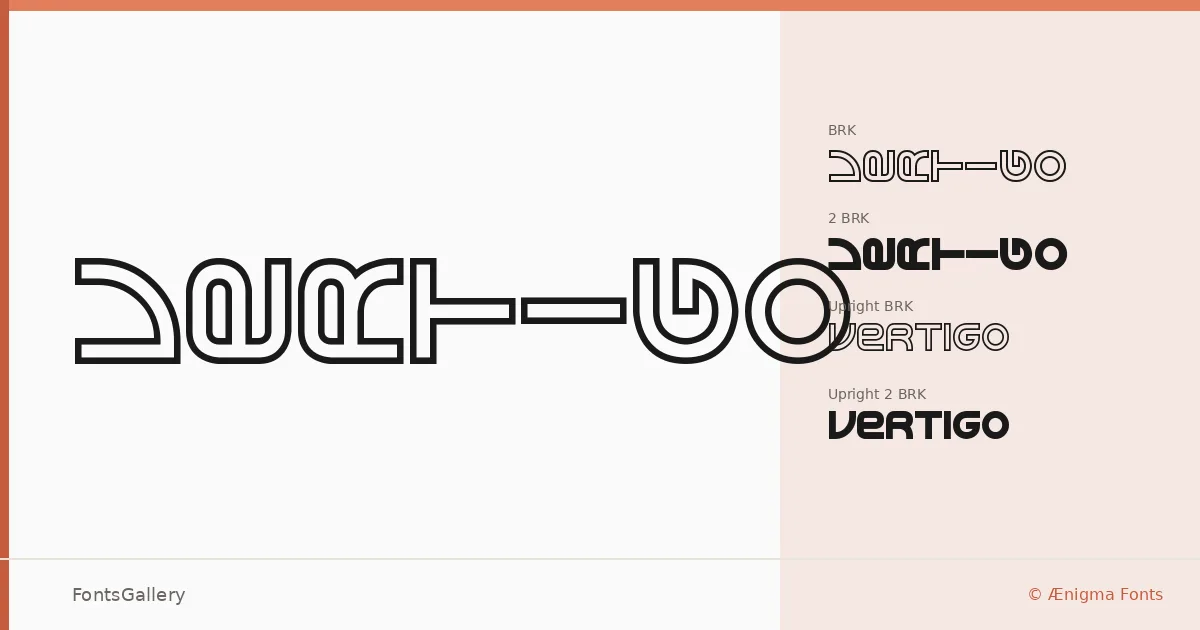
There is something deliberately unsettled about the letterforms here — a grunge edge pulled through a futuristic skeleton, as if industrial signage had been left out in the weather and came back stranger. The family was designed by Brian Kent of Ænigma Fonts and arrives in four distinct cuts: Vertigo BRK, Vertigo 2 BRK, Vertigo Upright BRK, and Vertigo Upright 2 BRK, each a Regular weight delivered as TTF. The numbered and upright variants let you shift the angle of attack without abandoning the underlying character of the face.
Design Aesthetics & Character Characteristics
This is a display family built for impact rather than extended reading, and it knows it. The mood runs bold and modern with a grunge texture that keeps it from feeling sterile — there is grit in the strokes that gives headlines a physical weight. The upright cuts offer a more disciplined stance when the angled versions feel too kinetic, and having both in the family means you can create contrast within a single layout without introducing a foreign voice.
Recommended Usage & Font Pairing
The natural territory here is anywhere a headline needs to arrest attention before it communicates — posters, logo lockups, branding systems with an edge, and t-shirt graphics where rough-edged energy reads well at scale. Latin script is supported partially, so check your character set against any copy that strays outside standard Western text. It pairs well with clean, neutral companions like Helvetica or Asap, and holds its own alongside more editorial faces such as Canela, Etna, ABC Arizona — the contrast between the raw display weight and a refined text face tends to work in its favor.
License & Usage Terms
This family is available for commercial use, and the embedding permission is set to installable. The copyright notice advises reading the included text file for full terms, so do that before deploying.