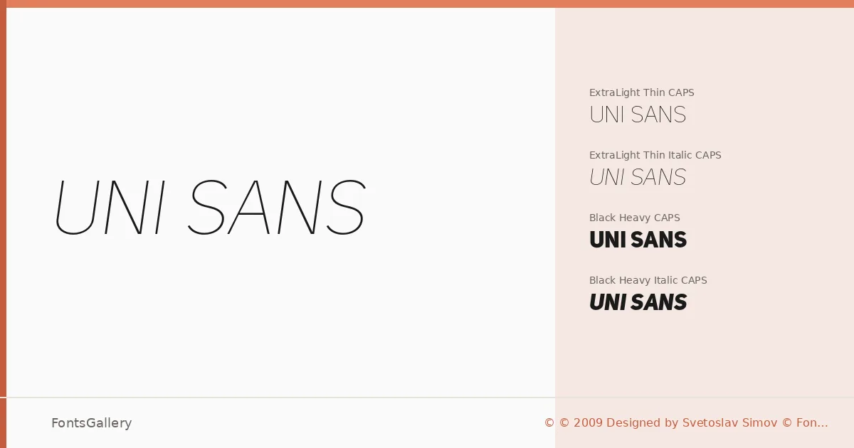
About Uni Sans Font
There is a clarity to the all-caps construction here that announces itself immediately — no lowercase to soften the geometry, just clean, upright forms with precisely measured spacing. Svetoslav Simov of Fontfabric designed this family as a geometric sans built for the kind of contexts where letterforms need to hold their own at scale. The dual-script coverage — Latin and Cyrillic — makes it genuinely useful across a wider range of editorial and branding markets than most headline faces of this type.
Design Aesthetics & Character Characteristics
The family ships in four OTF cuts: two weights at opposite ends of the spectrum — ExtraLight Thin CAPS and Black Heavy CAPS — each paired with a corresponding italic. That pairing of extremes is intentional: the Thin cuts feel restrained and minimal, while the Heavy cuts land with the kind of authority that belongs on a poster or masthead. All four styles are capitals-only, which keeps the character set disciplined and the aesthetic relentlessly modern. The geometric underpinning gives the whole family a professional consistency, whether you're setting at 8pt or 80pt.
Recommended Usage & Font Pairing
This is a family built for headline work — branding identities, logo lockups, magazine covers, and large-format poster design are where it earns its keep. The Thin Italic introduces tension and movement into layouts that might otherwise feel static, while the Heavy cuts work for wordmarks that need density and presence. It pairs with serif or script contrasts well; the named companions in this catalog include Canela, Armelie, Minecraft, AQUA, and Kactigona, each offering a different tonal counterpoint to those all-caps structures.
License & Usage Terms
Uni Sans is available for commercial use, and the files are licensed with editable embedding permissions, so they can be embedded in documents that end users may modify.