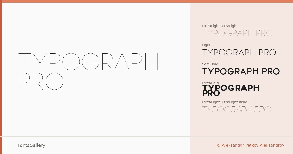
About TYPOGRAPH PRO Font
There is a deliberate restraint to the letterforms here — strokes that thin at exactly the right moment, a geometry that holds together across a wide span of weights. Aleksandar Aleksandrov, working under his foundry Aleksandar Petkov Aleksandrov, built this family with an eye for the kind of quiet authority that luxury editorial work demands. The construction is clean without being cold.
Design Aesthetics & Character Characteristics
This is a sans serif in the elegant, minimal register — the sort of face that reads as modern without chasing trends. The family spans UltraLight and UltraLight Italic through Light and Light Italic, continues into SemiBold and SemiBold Italic, and reaches its furthest extreme in a standalone ExtraBold, giving you a range from near-whisper to blunt emphasis. Each weight carries its upright companion in italic, and the whole set ships in TTF. The lighter cuts are especially refined — that UltraLight has the kind of fragility that photographs well in high-end contexts.
Recommended Usage & Font Pairing
The weight range and the restrained geometry make it well suited to branding work, logo lockups, magazine layouts, and website headers where a luxury or minimal mood is the brief. Latin is the primary script coverage, with partial extended Latin support. For pairing, the family works alongside Canela's editorial warmth, ABC Arizona's rational structure, and the more decorative character of Angeletta or Armelie — Minecraft sits at the opposite end of the tonal spectrum and could work as a deliberate contrast play.
License & Usage Terms
This family is released under a Personal Use license, which means commercial use is not permitted — confirm clearance before taking it into any client or revenue-generating work. Embedding is restricted to preview and print only.