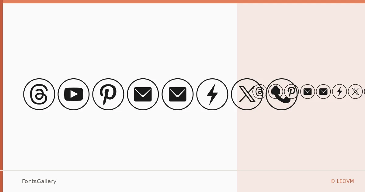
About typeecon Font
There is a quiet confidence to this face — the kind that comes from stripping letterforms down to their structural essentials without losing personality. Designed by LEOVM, typeecon arrives as a single Regular weight in OTF format, which tells you something about its intent: this is a face built around a precise, considered idea rather than a sprawling system.
Design Aesthetics & Character Characteristics
Sitting in the decorative category while carrying a distinctly minimal and modern sensibility, it occupies an interesting middle ground — disciplined enough to read as professional, distinctive enough to hold its own in identity work. The single Regular cut means you work with its inherent character rather than leaning on weight contrast, which rewards careful sizing and spacing. At larger settings, the forms have the kind of restrained geometry that feels at home in contemporary branding contexts.
Recommended Usage & Font Pairing
It earns its keep in branding, logo lockups, social media graphics, and website headers — anywhere a headline needs to project calm authority without resorting to noise. When you need to build out a typographic system around it, it pairs naturally with Canela for editorial warmth, Helvetica or Bahnschrift for neutral workhorse text, and sits interestingly alongside the contrasting personalities of Etna and AQUA.
License & Usage Terms
The family is available for commercial use, and embedding is permitted at editable level — both practical allowances for professional deployment.