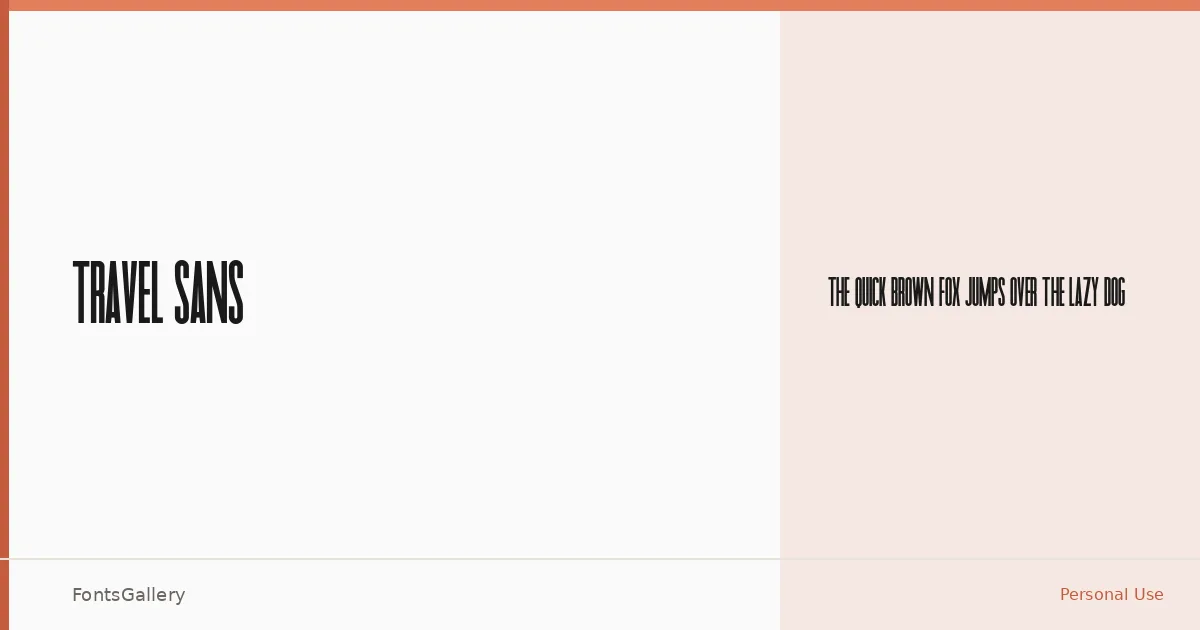
About Travel Sans Font
There is a clean directness to this sans — the kind of geometric restraint that holds its own at large sizes without demanding attention through ornament. Travel Sans arrives as a single Regular weight, available in both TTF and OTF formats, built around minimal strokes and confident spacing.
Design Aesthetics & Character Characteristics
The face sits squarely in the modern sans tradition: professional, bold in presence even at a standard weight, and stripped of anything decorative. The minimal structure means it reads as authoritative rather than cold, which is exactly the balance headline and branding work demands. One weight means you are working with proportion and size to create hierarchy rather than leaning on a weight axis.
Recommended Usage & Font Pairing
It earns its place in logo lockups, editorial headlines, and poster layouts where a clean, modern voice is needed without visual noise. Magazine folios and brand identity systems are natural fits. For contrast and warmth, the family pairs well with Canela or the expressive curves of Armelie; for something more aggressive, 321 Impact or Kactigona push the energy up, while AQUA can introduce a lighter decorative counterpoint.
License & Usage Terms
This family is released under Personal Use terms, which means commercial use is not permitted — confirm licensing directly with the rights holder before deploying it in any paid or client-facing work. Embedding is permitted as editable.