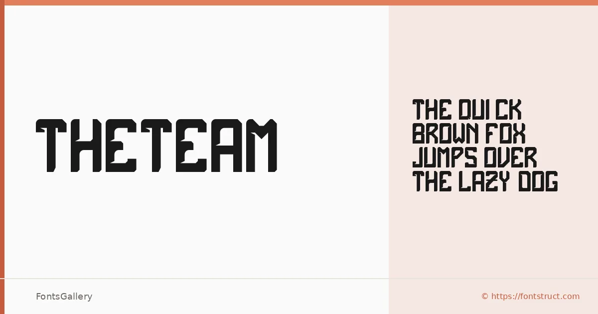
About theTeam Font
There is an immediacy to this display face — the kind of weight and presence that reads across a room before you've had time to focus. Built by designer rikyozone using FontStruct, it was conceived specifically for team jerseys, and that origin shows in every letter: the forms are built to hold up large, stitched, printed, or pressed onto fabric.
Design Aesthetics & Character Characteristics
The family arrives as a single cut — theTeam Regular — in TTF format, covering the Latin script. Its mood sits squarely in bold and modern territory, with a professional confidence that doesn't rely on ornamentation. The letterforms are direct and constructed, the kind of shapes that stay legible when blown up to headline scale or reduced to a chest number.
Recommended Usage & Font Pairing
The natural territory here is branding, logo work, poster headlines, signage, and T-shirt design — anywhere a mark needs to land with authority. It pairs well with clean, contrasting companions: Helvetica or Bahnschrift for neutral sans support, Canela when you want editorial warmth alongside it, Etna for a harder industrial contrast, or AQUA when the project calls for something with more graphic energy.
License & Usage Terms
Released under the Open Font License, this family is available for commercial use. Note that embedding is permitted for preview and print only, so confirm those constraints suit your workflow before deploying in interactive or editable documents.