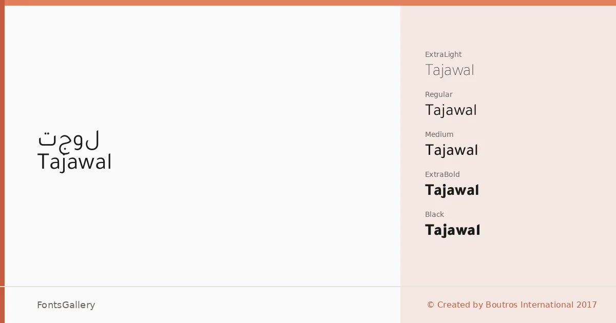
About Tajawal Font
There is a quiet confidence to this sans — the Arabic and Latin letterforms share the same geometric sensibility without either script feeling like an afterthought. Boutros Fonts, working under Boutros International, released this dual-script family in 2017 with the clear intention of serving both writing systems equally. The Arabic glyphs carry that same clean, open geometry the Latin does, which is genuinely rare and worth noting.
Design Aesthetics & Character Characteristics
The family spans seven weights — ExtraLight through Black, with Light, Regular, Medium, Bold, and ExtraBold in between — giving you a complete working range from delicate editorial use to heavy display. The mood is minimal and modern, with professional restraint rather than decorative flourish. In the lighter cuts the forms feel airy enough for long-format reading; in the heavier weights the geometry holds firm and reads as authoritative. All styles are delivered as TTFs.
Recommended Usage & Font Pairing
The weight range and dual Latin–Arabic coverage make this a natural fit for branding, logo lockups, magazine layouts, and website headers wherever bilingual or Arabic-language work is involved. Presentations benefit from the clean hierarchy the seven weights provide. For pairing, the family works well alongside Canela, Armelie, 321 Impact, AQUA, and Kactigona, each offering a contrasting texture that lets Tajawal's geometric neutrality anchor the composition.
License & Usage Terms
Released under the SIL Open Font License, Version 1.1, commercial use is permitted and the fonts carry installable embedding permissions — full terms and the accompanying FAQ are available at http://scripts.sil.org/OFL.