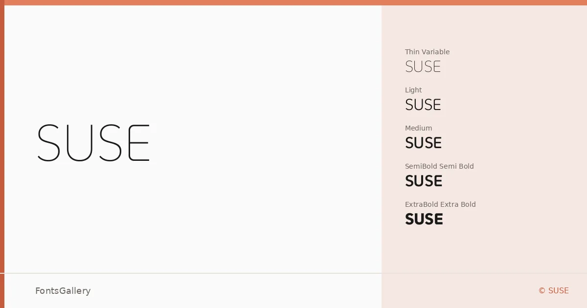
About SUSE Font
There is a quiet confidence to these letterforms — the kind that comes from restraint exercised with intent, not indifference. Designed by René Bieder for SUSE, this sans serif moves through Latin text with clean geometry and even spacing that holds up whether a word is set large or small. Nothing here is decorative; every curve and terminal is working.
Design Aesthetics & Character Characteristics
The family occupies the minimal, modern end of the sans serif spectrum, with a professional bearing that never tips into coldness. Nine weights are available — Thin and ExtraLight through ExtraBold, plus a Variable font that steps continuously across that range — all delivered as TTFs. The weight progression is well-judged: the lighter cuts feel open and airy, the heavier ones carry real authority without losing the underlying neutrality that ties the family together.
Recommended Usage & Font Pairing
The range of weights makes it a natural fit for branding systems, presentation decks, website headers, and business cards where consistent hierarchy matters across multiple touchpoints. Logo work benefits from the geometric steadiness of the middle weights, while the extremes give designers contrast to play with. For pairing, the family sits comfortably alongside editorial faces like Canela and ABC Arizona, gains personality next to Armelie or Angeletta, and holds its ground even in the more unexpected company of Minecraft.
License & Usage Terms
Released under the SIL Open Font License (OFL), Version 1.1, with full commercial use permitted and installable embedding rights — details and the complete FAQ are at https://openfontlicense.org.