About Supertext Font
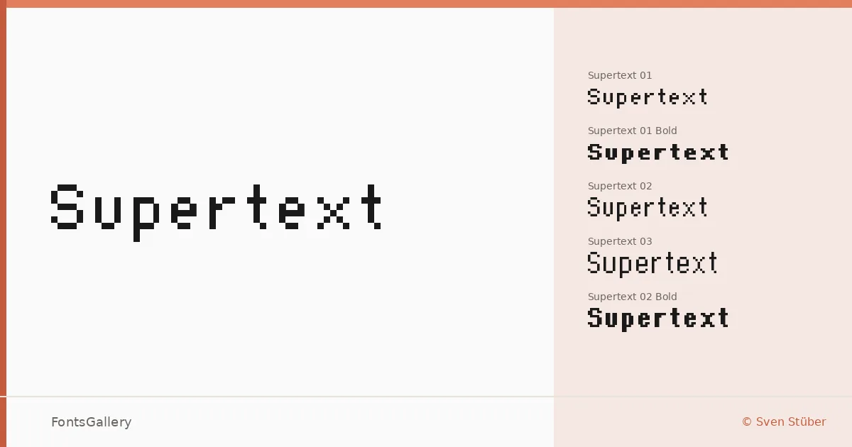
There is something deliberately mechanical about the spacing here — every character occupying its fixed cell with a kind of unapologetic rigidity. Sven Stüber's monospace family comes in three distinct variants, each offered in Regular and Bold, giving designers six cuts to work with across the TTF files.
Design Aesthetics & Character Characteristics
The three numbered subfamilies — 01, 02, and 03 — each carry the same futuristic, minimal sensibility while varying enough in their letterforms to suit different tonal needs. The mood is modern and bold-leaning even at regular weight, with geometry that reads as technical without tipping into cold abstraction. In heavier settings, the Bold cuts push toward the kind of graphic density that makes headlines feel architectural rather than typographic.
Recommended Usage & Font Pairing
The fixed-width construction suits high-contrast applications: poster headlines, logo lockups, branding systems that need a bit of structural edge, and t-shirt graphics where rhythm across a line of text carries visual weight on its own. Latin script is partially supported, so verify character coverage against any copy before committing. For contrast pairings, the rigid grid plays well against the organic curves of Canela or ABC Arizona, and the shared functionalist DNA makes Bahnschrift or Helvetica natural companions; Etna is another option worth testing in layered compositions.
License & Usage Terms
Supertext is released under a Freeware license with personal-use terms only — confirm with the rights holder before applying it to any commercial job. Embedding is set to installable.