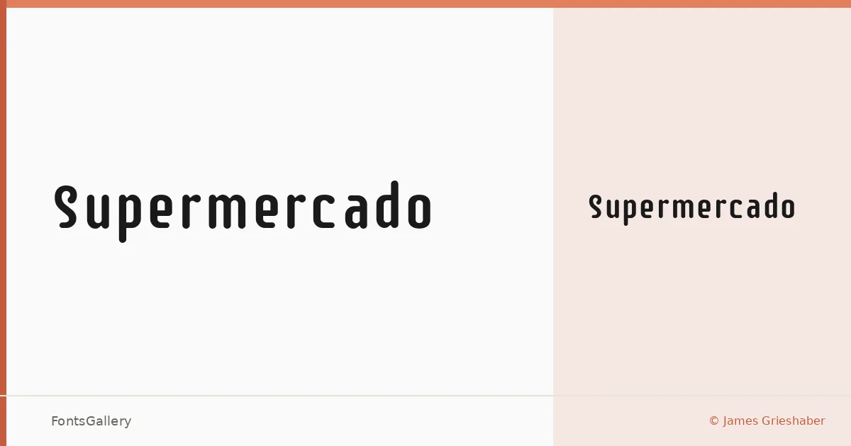
About Supermercado Font
There is something immediately familiar about these letterforms — and then something slightly off, in the best way. James Grieshaber designed this semi-geometric display face drawing from naive industrial lettering, the kind of rough, hand-painted signage that predates digital precision. The result is a Latin typeface that carries both a modern structural logic and a warmth that pure geometry rarely allows.
Design Aesthetics & Character Characteristics
Available as a single Regular weight in TTF format, this is a display face with a bold, playful character rooted in vintage industrial sources. What keeps it from reading as merely retro are the unexpected swashes worked into the capitals — a detail that gives headlines and logos a sense of personality without tipping into novelty. The low contrast between strokes keeps things readable even when the size drops, which is unusual territory for a face this distinctive.
Recommended Usage & Font Pairing
It earns its place in branding, poster work, signage, and logo design — anywhere a headline needs to project confidence without the coldness of a strict geometric. The swashed capitals work particularly well at large sizes on packaging or environmental graphics. For text companions, it sits well alongside Helvetica for a clean functional contrast, or next to Canela, Etna, AQUA, and Asap when the project calls for something with more editorial range.
License & Usage Terms
Released under the SIL Open Font License, Version 1.1, which permits commercial use freely — full terms are at http://scripts.sil.org/OFL. Embedding is set to installable.