About Suisse Intl Font
There is a particular kind of neutrality that takes enormous effort to achieve — the kind where the letters feel inevitable rather than designed. Swiss Typefaces has built exactly that here: a geometric grotesque that reads with the cool, disciplined economy you associate with mid-century Swiss typography, yet carries enough optical refinement to feel entirely contemporary. The spacing is tight without crowding, and the stroke weight transitions are controlled to the point of near-invisibility.
Design Aesthetics & Character Characteristics
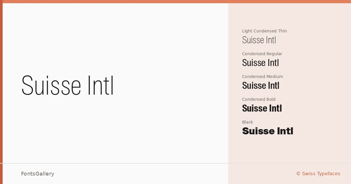
The family spans an exceptional range — from Hairline and Hairline Italic through Thin, Light, Book, Medium, Semibold, Bold, and Black, each with italics — and extends into distinct sub-families: a condensed variant, a monospaced cut, a screen-optimised series, a Neue interpretation, and a Works branch. All files are offered in OTF format. The mood across the range stays consistently minimal and professional; even the heavier weights retain the rational, clean geometry that makes it so readable at both display and text sizes.
Recommended Usage & Font Pairing
The breadth of weights and variants makes this a natural fit for branding systems, magazine layouts, website headers, presentation decks, and environmental signage — anywhere a coherent, modern sans needs to carry work across multiple contexts. Latin, Vietnamese, and Cyrillic are all supported, which broadens its usefulness for multilingual editorial and identity work. It pairs well with the contrast-heavy serifs of Canela or the display character of Kactigona, and sits comfortably alongside Armelie, 321 Impact, and AQUA when a project needs more tonal range.
License & Usage Terms
This family is available under a Demo license — these are personal-use trial terms, and commercial use is not permitted; confirm licensing requirements at Swiss Typefaces' site before committing to a client job. Embedding is limited to preview and print only.