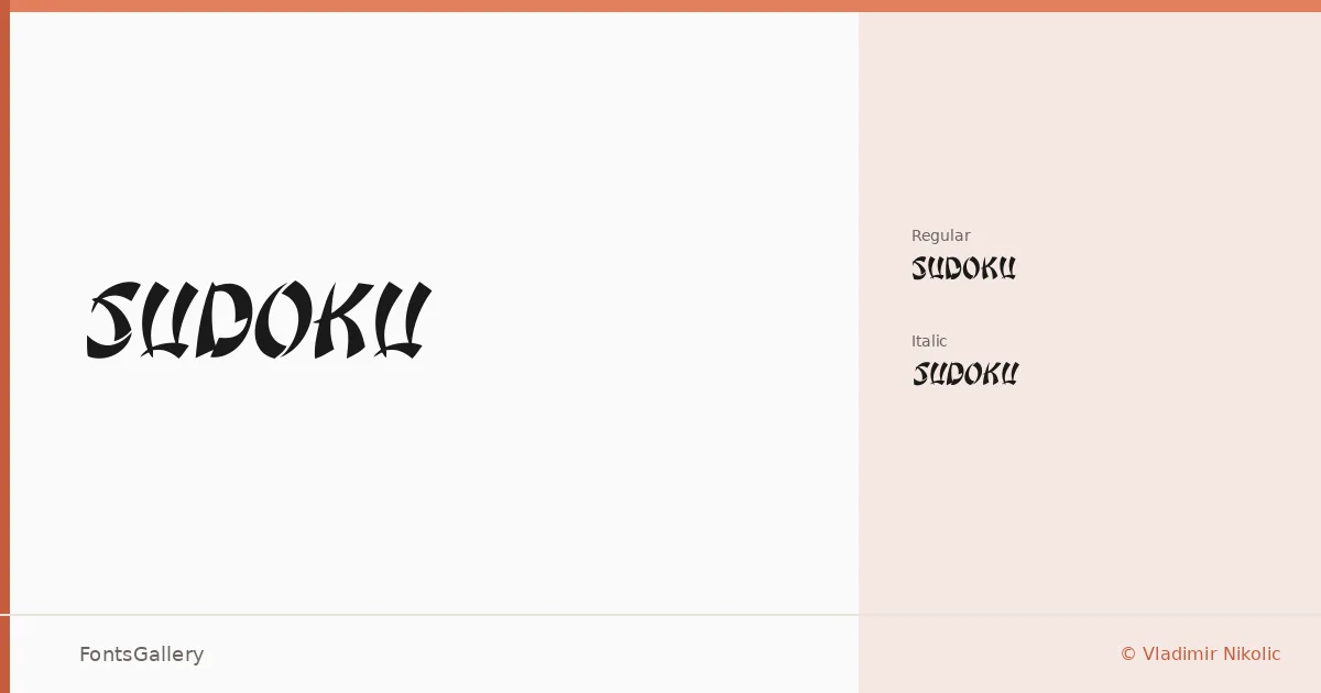
About Sudoku Font
There is real tension in the blackletter strokes here — the kind that comes from thick-to-thin transitions drawn with conviction rather than formula. Vladimir Nikolic built this family in two cuts: a Regular and a Regular Italic, both delivered as TTFs with partial Latin coverage. The letterforms carry that compressed, angular energy that good blackletter demands without tipping into illegibility.
Design Aesthetics & Character Characteristics
The mood sits firmly in bold, classic territory with a grunge undercurrent that keeps it from feeling like a period reproduction — it reads vintage without being a museum piece. The Regular stands upright with authority, while the Italic leans into a slightly more agitated rhythm that suits display use especially well. Both cuts are built for impact at large sizes: the contrast is high, the details reward close inspection, and the overall texture on the page is dense and deliberate.
Recommended Usage & Font Pairing
This is a headline and logo face first — think band merch, editorial mastheads, poster type, or branding that needs to project a raw, historical authority. T-shirt design work is a natural fit given the weight and the way the forms hold up against busy backgrounds. For contrast pairings, the listed companions span a wide range: the clean geometry of Helvetica or Bahnschrift will give body copy room to breathe against these blackletter headers, while Etna, Canela, and ABC Arizona each offer a more editorial counterpoint for layered typographic compositions.
License & Usage Terms
This family is released under Personal Use terms, which means commercial use is not permitted — confirm licensing directly with Vladimir Nikolic before deploying it in a client or commercial project. Embedding is restricted to preview and print only.