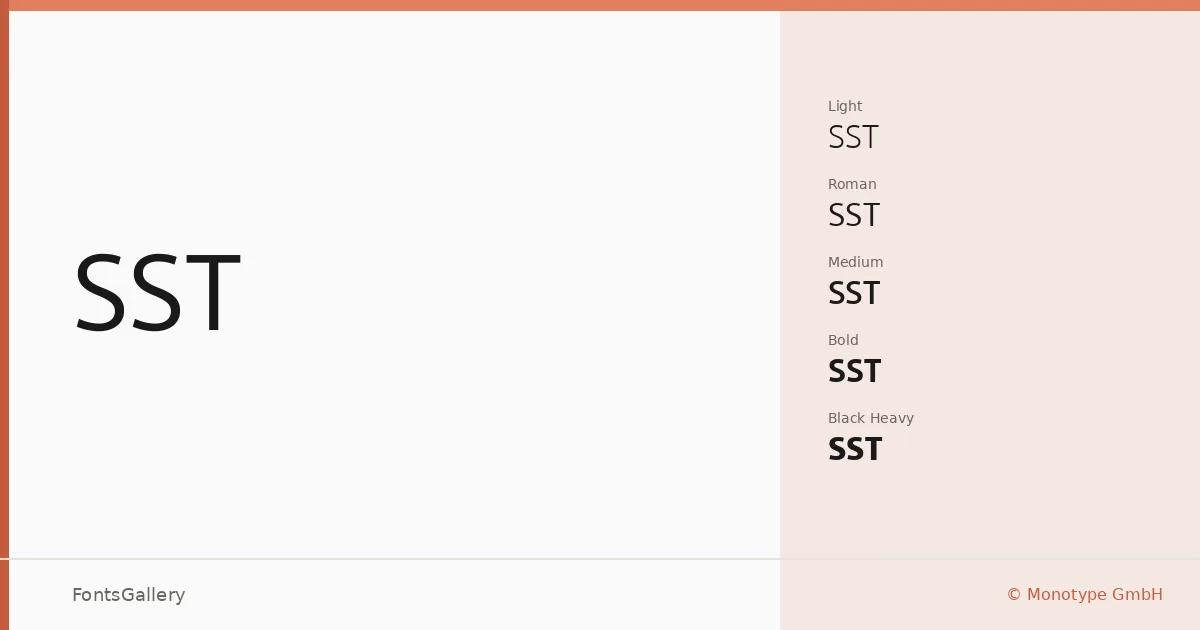
About SST Font
There is a particular kind of restraint in this sans — the strokes are even, the terminals clean, the overall texture calm without being cold. Designed by Akira Kobayashi and the Monotype Design Studio, and released by Monotype GmbH, SST was built from the ground up to carry global branding across many scripts and many media without losing its composure.
Design Aesthetics & Character Characteristics
The family runs from Light and Light Italic through Roman, Italic, Medium, Medium Italic, Bold, and Bold Italic, with Condensed, Condensed Medium, and Condensed Bold cuts adding width flexibility, and Heavy and Heavy Italic anchoring the heavy end — thirteen styles in total, delivered as TTFs. The mood throughout is modern and professional: minimal in detail, confident in weight, and consistent enough in tone that Light and Heavy can share a layout without argument. Latin, Cyrillic, and Greek coverage means the character set holds together across multilingual work without switching faces.
Recommended Usage & Font Pairing
The range of widths and weights makes this well suited to signage, large-format advertising, magazine editorial, presentation decks, and branding systems where consistency across sizes matters. The condensed cuts are especially useful when headline space is tight or a display needs to carry a lot of text in a narrow column. For contrast in a layout, the listed pairing options include Canela, Armelie, 321 Impact, AQUA, and Kactigona.
License & Usage Terms
This family is available under Personal Use terms only — commercial use is not permitted under this license, and embedding is restricted to preview and print. Confirm the terms of your specific license agreement with Monotype directly before applying this to any commercial job.