About Soria Font
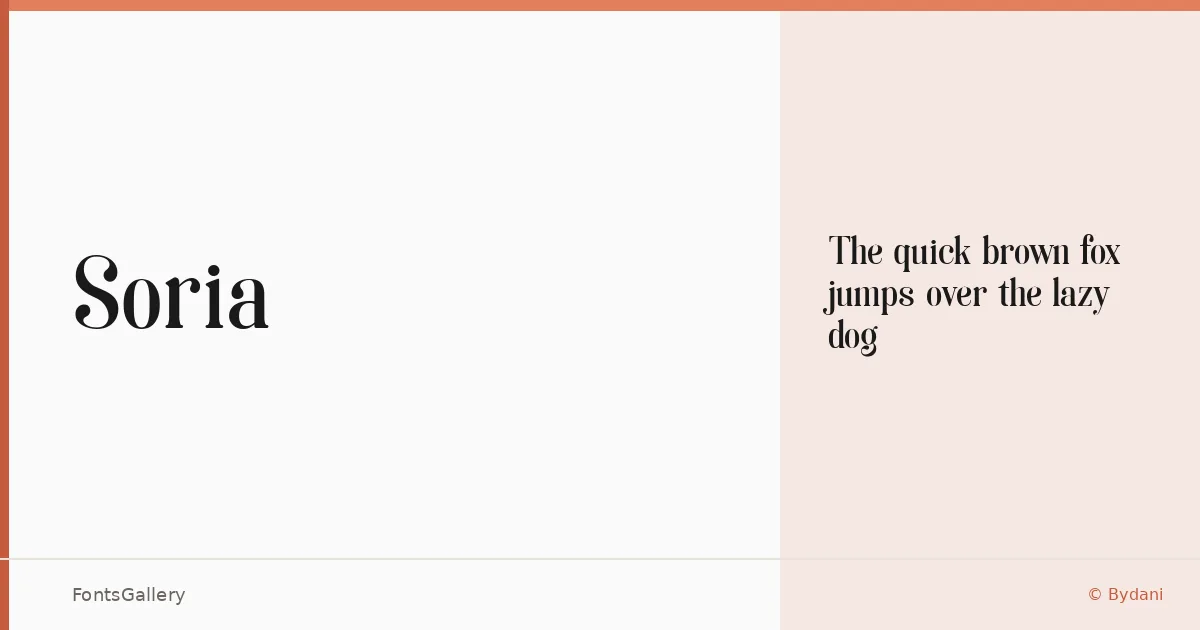
There is a particular tension in this serif — the kind that sits between classical structure and something sharper, more considered. It comes from Bydani, a single-cut family delivered in Regular weight as a TTF file, with partial Latin coverage. The letterforms carry a restrained elegance that reads less like historical revival and more like a deliberate, contemporary reduction of serif conventions.
Design Aesthetics & Character Characteristics
The mood here is classic and luxurious without being heavy-handed — the serifs are clean, the proportions modern enough to feel at home in current editorial and brand contexts. With only the Regular style in the family, the design relies entirely on its own geometry to do the work, and it holds up well at large sizes where the subtleties of the construction become visible. Think of it as a headline face that knows exactly what it is.
Recommended Usage & Font Pairing
It earns its place in branding, logo lockups, magazine headlines, and book cover treatments — anywhere that a single weight of a considered serif can anchor a layout with confidence. Partial Latin coverage is worth keeping in mind if your project demands broad language support. For text-level contrast, it pairs well with Helvetica or Asap; for more expressive combinations, Armelie, Etna, or Kactigona each offer interesting counterpoints depending on the tone of the project.
License & Usage Terms
Soria is available under Personal Use terms only — commercial use is not permitted, so confirm your usage rights before taking it into a client job. The license follows Creative Commons BY-ND 4.0 terms, requiring attribution and prohibiting distribution of modified versions; embedding is limited to preview and print only.