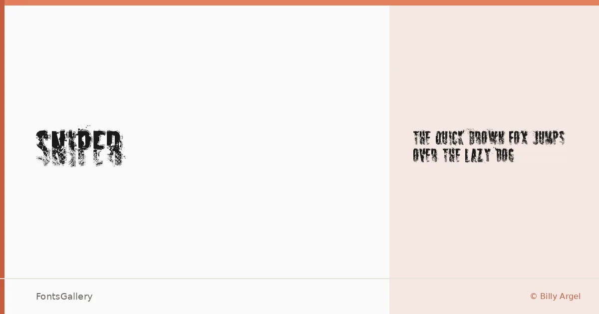
About SNIPER Font
There is a raw, deliberate roughness to these letterforms — the kind that looks like it was earned rather than designed. Billy Argel built this display face with a grunge sensibility that sits somewhere between military stencil and worn vintage signage, and that tension is exactly what gives it character.
Design Aesthetics & Character Characteristics
Available as a single Regular weight in TTF format, this is a display face that commits fully to its mood: bold, rustic, and unapologetically vintage. The forms carry that heavy, distressed quality you reach for when clean and polished would be the wrong call entirely — when the work needs grit, history, or a sense of something weathered and real. It reads loud at large sizes and holds its attitude in headlines without needing backup from additional weights.
Recommended Usage & Font Pairing
The obvious territory is anywhere texture and attitude drive the concept — posters, T-shirt graphics, logos, and brand marks that need to feel rough-edged rather than refined. For contrast pairings, the listed options span a useful range: the neutrality of Helvetica or Asap can ground it, while Canela, Etna, or ABC Arizona offer more editorial counterpoints for layouts that want something less expected beneath the headline.
License & Usage Terms
This family is released under Personal Use terms only, with embedding restricted — confirm with Billy Argel at billyargel.blogspot.com before placing it in any commercial job.