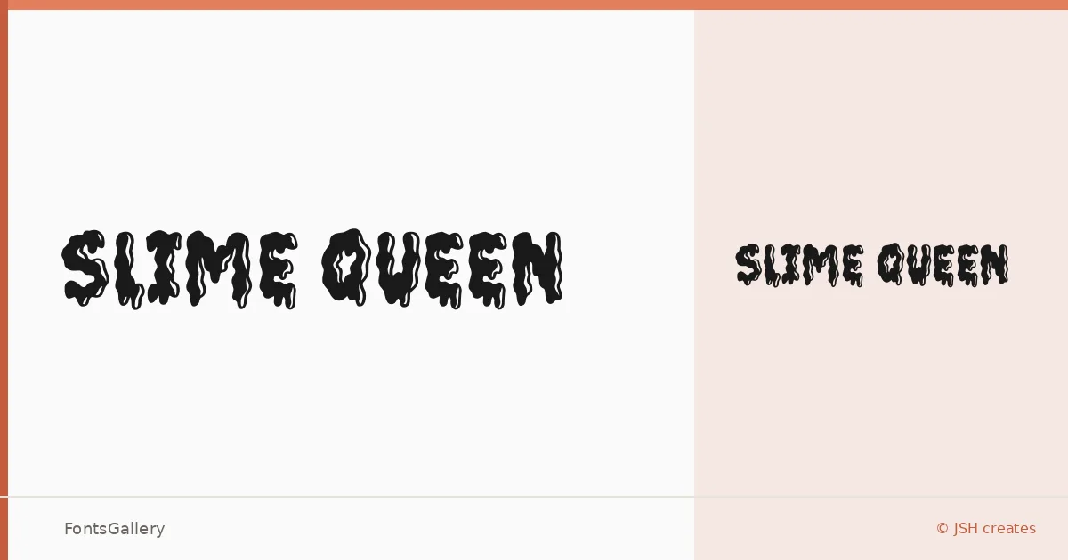
About Slime Queen Font
There is a deliberate messiness to this display face — letters that feel like they were pulled apart and set back down slightly wrong, in the best way. Jonathan S. Harris of JSH creates designed it as a single Regular weight, delivered as a TTF, with a character that leans hard into grunge without losing its playful edge.
Design Aesthetics & Character Characteristics
The forms sit somewhere between bold and whimsical, with enough texture and attitude to read as grunge while still carrying a sense of fun. This is a display cut, not a workhorse — it exists at large sizes, where every irregularity in the letterforms becomes part of the personality. Set it big and it rewards you; shrink it down and the character collapses.
Recommended Usage & Font Pairing
The face earns its keep on posters, packaging, and social media graphics where a strong visual identity is the whole point — T-shirt designs and branding work with an edge are natural fits. Paired against the clean geometry of Helvetica or Bahnschrift, the contrast sharpens both; alongside the editorial warmth of Canela or ABC Arizona, it picks up a more curated tension. Etna, similarly expressive, would push the composition into bolder territory.
License & Usage Terms
Slime Queen is available under Personal Use terms only — confirm with the license agreement included in your download before applying it to any commercial job, and visit jshcreates.com for the full terms.