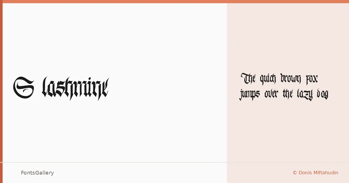
About Slashmine Font
There is something deliberately raw about the way these blackletter strokes are cut — angular, weighted, and carrying the kind of tension you expect from type that belongs on a stage or a wall rather than a spreadsheet. Slashmine was designed by Donis Miftahudin of Din Studio, and it arrives as a single Regular cut in OTF format. The letterforms sit in that charged space between historical blackletter tradition and contemporary grunge sensibility.
Design Aesthetics & Character Characteristics
The mood here is bold and classic with a deliberate vintage roughness — the kind of type that reads as handcrafted even when it is set at a large display size. As a blackletter, it carries the expected density of stroke contrast and pointed terminals, but the overall character tilts more toward modern grunge than manuscript formality. Coverage is Latin. With only the one style available, the design asks you to commit to its full weight from the start, which suits headline and logotype work well.
Recommended Usage & Font Pairing
The face is built for branding, logo lockups, poster headlines, magazine covers, and T-shirt graphics — anywhere that a strong, characterful display setting does the heavy lifting. At large sizes the grunge qualities become an asset rather than noise. It pairs well against the cleaner geometries of Helvetica or Bahnschrift, the editorial warmth of Canela or ABC Arizona, and the restrained structure of Etna — any of these can provide the body-text counterpoint that a single-weight blackletter needs.
License & Usage Terms
This family is released under Personal Use terms only — confirm a commercial license at din-studio.com before using it in client work, retail products, or any revenue-generating context, as copyright infringement is legally enforced by the designer.